
The Long And Winding Road to My Order 3.0
November 2019
Researcher: Meidirasari Putri
UX Designer: Muhammad Raufan
UI Designer: Jessica Yasmine
Back in October 2018, it was exactly the project started. My Order 3.0 was part of a new face of tiket.com, to obviously help users to manage their orders on our product. We have implemented continuously design process that concerns user-centric.
We have also involved more stakeholders (more designers, more researchers, product managers, sales and marketing team) to align with the business goal. In short, we brought about miracles (re:user insights) through this following process:
We have also involved more stakeholders (more designers, more researchers, product managers, sales and marketing team) to align with the business goal. In short, we brought about miracles (re:user insights) through this following process:
- Explore: discover and prioritise user needs
- Learn and consider: create and validate preliminary assumptions
- Design & build prototype: work collaboratively with UX and UI designers
- Test & iterate: conduct several usability tests using prototype to iterate

How we do UX process at tiket.com
Stage 1: Explore
In this stage, we have done several activities to discover users’ need and pain points while checkin on their current/past orders. Initially, extensive desk research has been done to understand the user behaviour. We investigated the user journey to map in what stages that My Order is going to be used.

Stage 2: Learn and Consider
In this stage, we have done several methods to uncover and validate the users’ problems while accessing My Order pages.

Heuristic Evaluation
This method help us to find possible issues that users face on cross-platforms (website, mobile site and apps):
1. Inconsistent look and feel
2. Less centralised booking management
3. Inconsistent Order List and Order Detail pages
Competitive Analysis
Through this method, we mapped potential gaps that we might improve and implement to our new designs. There were at least 12 different indicators that we compared to. The main four indicators were: Order grouping type, feature exposure, controller and order detail page.
Stage 3: Design and Build Prototype
The previous stage (Stage 2) resulted the main users’ problems. Based on those, we conducted workshops to explore the opportunities and try to visualise them into potential ideas or even solutions.
-----
We explored ideas through design sprints and conducted short usability tests before we meet real users for a more comprehensive usability test.
-----
Design Workshop
We explored ideas through design sprints and conducted short usability tests before we meet real users for a more comprehensive usability test.
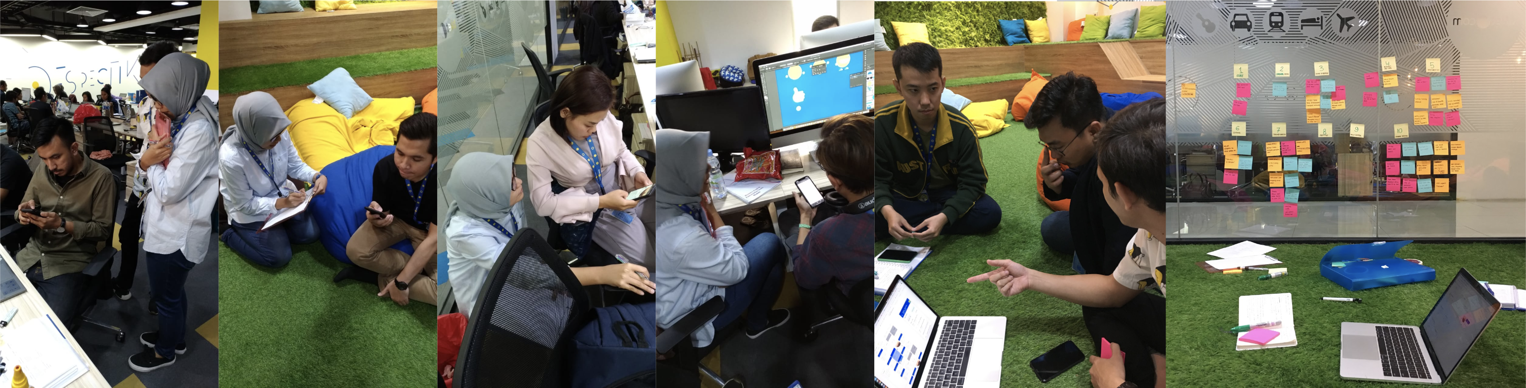
Design workshops with UI and UX Designers and internal teams.
Stage 4: Test, (Launch) and Iterate
At this final stage, we have finished our prototype and it was ready to be tested to the real users! After the testing days, of course, we had a lot of feedbacks. Before we deliver the final product to Tech team, we do several iterations to make sure the product is ready to launch. This was where the team collaboration is the most important thing. Yes, here we are an agile team.
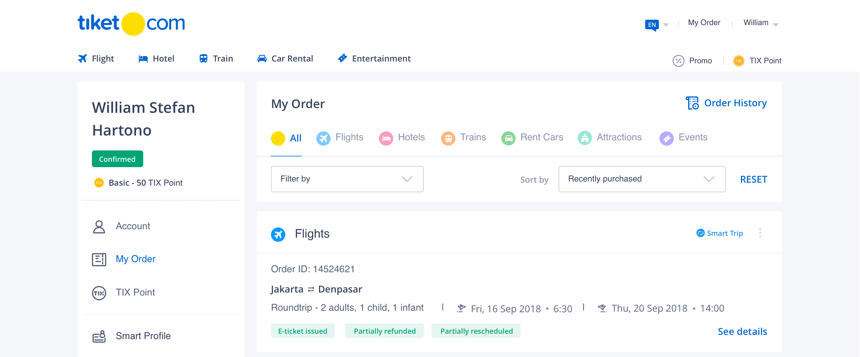
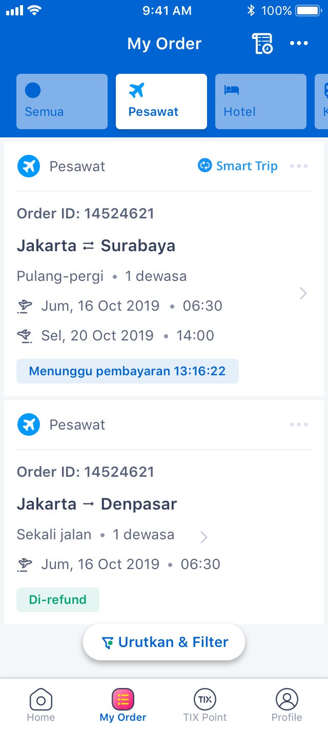
Hey, aren’t you curious how it looks like after the long and winding road we have been through? We started in October 2018 and we released it (finally) in July 2019.
Hey, aren’t you curious how it looks like after the long and winding road we have been through? We started in October 2018 and we released it (finally) in July 2019.
What have we learned so far?
After we have implemented the My Order new designs, there are two main achievements:
We solved users’ problem in terms of: easier order management from cross-platforms (website, mobile site and mobile apps), accommodating users to complete their travel experiences. We also have improved My Order to be more synchronised to other services (user profile and payment process).
Ssshh! It’s a secret! But we can share you a lil bit! According to data team, we have improved our performance since the release date. Hooray!
----
Well, we have not done yet. We are still exploring the opportunities to make users feel more comfortable and obviously purchase more on tiket.com!
Ease of Use
We solved users’ problem in terms of: easier order management from cross-platforms (website, mobile site and mobile apps), accommodating users to complete their travel experiences. We also have improved My Order to be more synchronised to other services (user profile and payment process).
Reliability
Ssshh! It’s a secret! But we can share you a lil bit! According to data team, we have improved our performance since the release date. Hooray!
----
Well, we have not done yet. We are still exploring the opportunities to make users feel more comfortable and obviously purchase more on tiket.com!