
The Long And Winding Road to My Order 3.0
November 2019
Researcher: Meidirasari Putri
UX Designer: Muhammad Raufan
UI Designer: Jessica Yasmine
Back in October 2018, it was exactly the project started. My Order 3.0 was part of a new face of tiket.com, to obviously help users to manage their orders on our product. We have implemented continuously design process that concerns user-centric.
We have also involved more stakeholders (more designers, more researchers, product managers, sales and marketing team) to align with the business goal. In short, we brought about miracles (re:user insights) through this following process:
We have also involved more stakeholders (more designers, more researchers, product managers, sales and marketing team) to align with the business goal. In short, we brought about miracles (re:user insights) through this following process:
- Explore: discover and prioritise user needs
- Learn and consider: create and validate preliminary assumptions
- Design & build prototype: work collaboratively with UX and UI designers
- Test & iterate: conduct several usability tests using prototype to iterate

How we do UX process at tiket.com
Stage 1: Explore
In this stage, we have done several activities to discover users’ need and pain points while checkin on their current/past orders. Initially, extensive desk research has been done to understand the user behaviour. We investigated the user journey to map in what stages that My Order is going to be used.

Stage 2: Learn and Consider
In this stage, we have done several methods to uncover and validate the users’ problems while accessing My Order pages.

Heuristic Evaluation
This method help us to find possible issues that users face on cross-platforms (website, mobile site and apps):
1. Inconsistent look and feel
2. Less centralised booking management
3. Inconsistent Order List and Order Detail pages
Competitive Analysis
Through this method, we mapped potential gaps that we might improve and implement to our new designs. There were at least 12 different indicators that we compared to. The main four indicators were: Order grouping type, feature exposure, controller and order detail page.
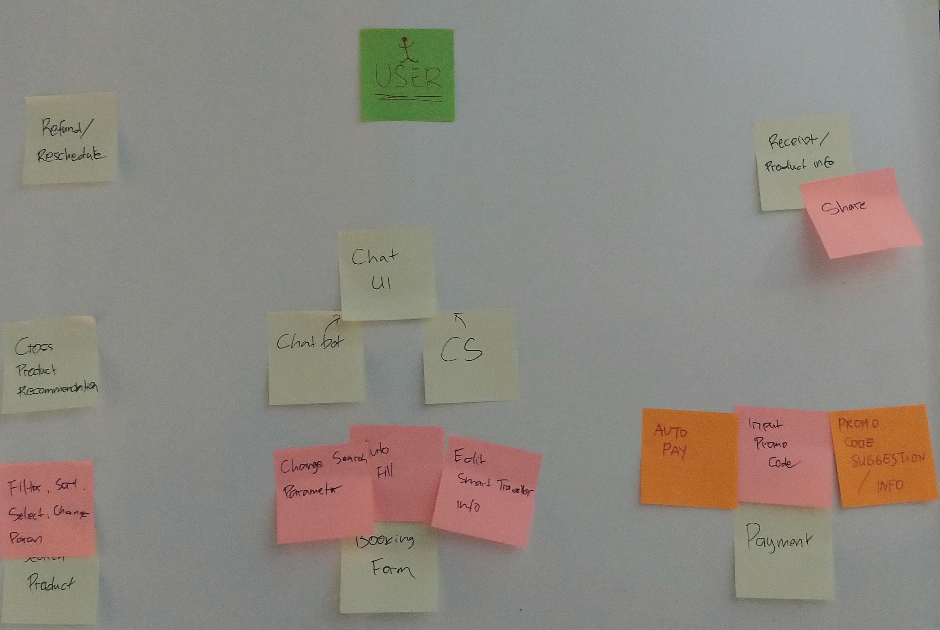
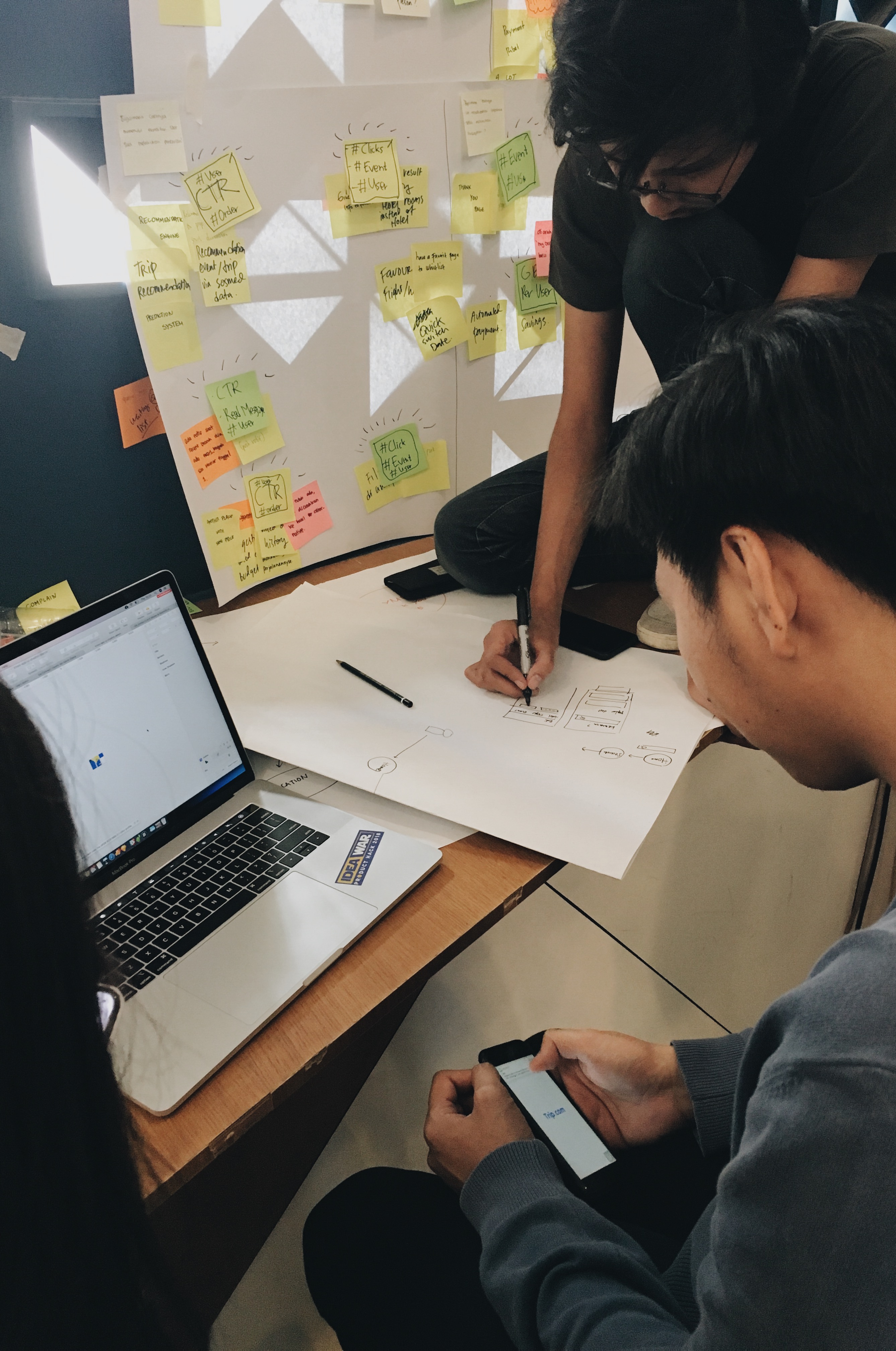
Stage 3: Design and Build Prototype
The previous stage (Stage 2) resulted the main users’ problems. Based on those, we conducted workshops to explore the opportunities and try to visualise them into potential ideas or even solutions.
-----
We explored ideas through design sprints and conducted short usability tests before we meet real users for a more comprehensive usability test.
-----
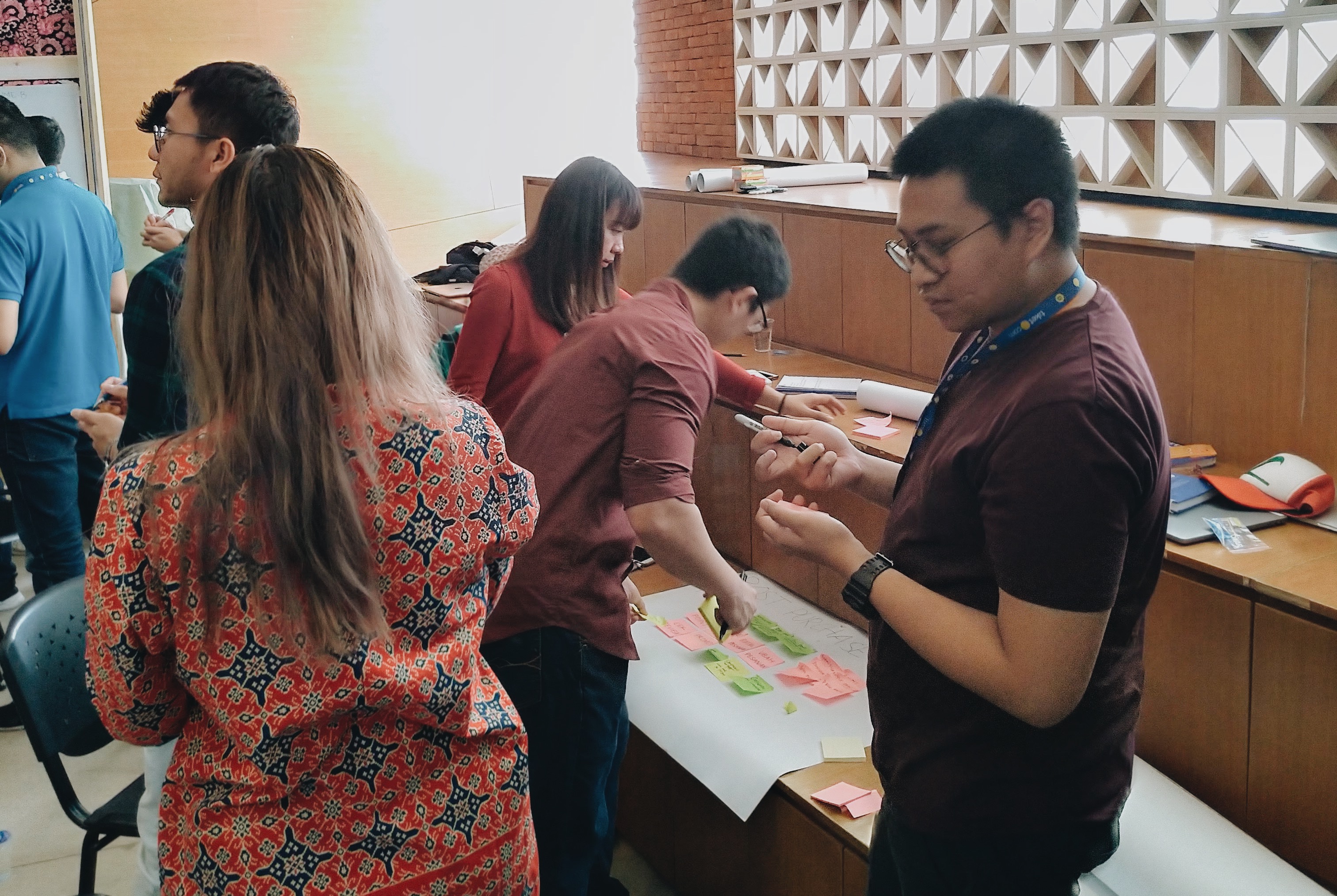
Design Workshop
We explored ideas through design sprints and conducted short usability tests before we meet real users for a more comprehensive usability test.
Design workshops with UI and UX Designers and internal teams.
Stage 4: Test, (Launch) and Iterate
At this final stage, we have finished our prototype and it was ready to be tested to the real users! After the testing days, of course, we had a lot of feedbacks. Before we deliver the final product to Tech team, we do several iterations to make sure the product is ready to launch. This was where the team collaboration is the most important thing. Yes, here we are an agile team.
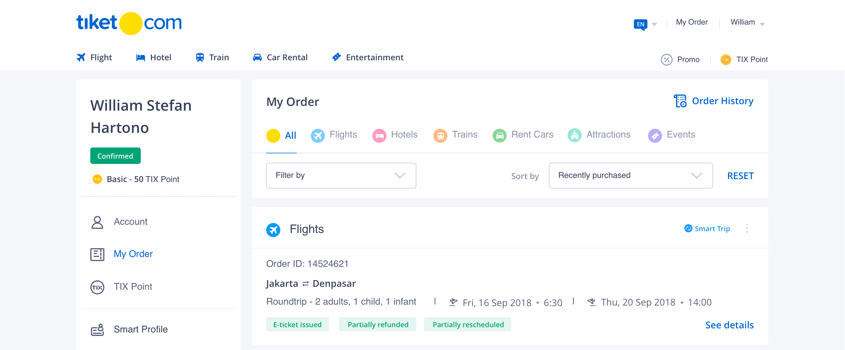
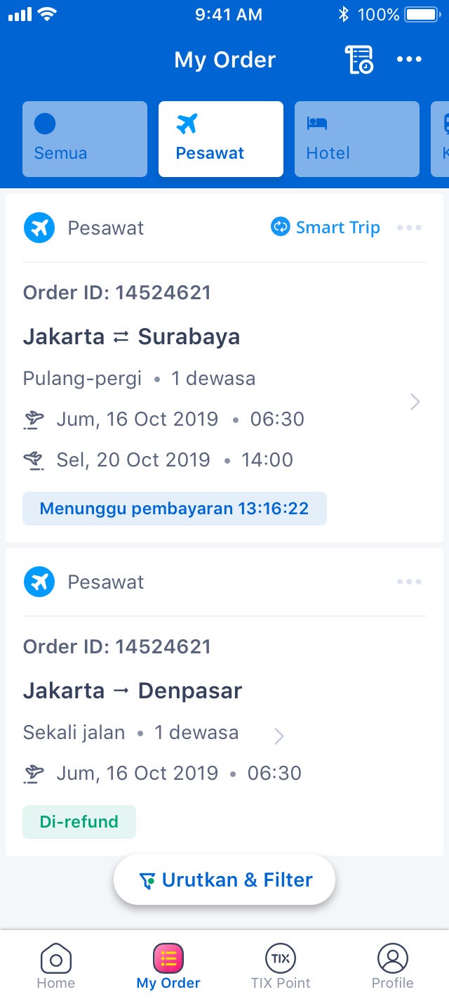
Hey, aren’t you curious how it looks like after the long and winding road we have been through? We started in October 2018 and we released it (finally) in July 2019.
Hey, aren’t you curious how it looks like after the long and winding road we have been through? We started in October 2018 and we released it (finally) in July 2019.
What have we learned so far?
After we have implemented the My Order new designs, there are two main achievements:
We solved users’ problem in terms of: easier order management from cross-platforms (website, mobile site and mobile apps), accommodating users to complete their travel experiences. We also have improved My Order to be more synchronised to other services (user profile and payment process).
Ssshh! It’s a secret! But we can share you a lil bit! According to data team, we have improved our performance since the release date. Hooray!
----
Well, we have not done yet. We are still exploring the opportunities to make users feel more comfortable and obviously purchase more on tiket.com!
Ease of Use
We solved users’ problem in terms of: easier order management from cross-platforms (website, mobile site and mobile apps), accommodating users to complete their travel experiences. We also have improved My Order to be more synchronised to other services (user profile and payment process).
Reliability
Ssshh! It’s a secret! But we can share you a lil bit! According to data team, we have improved our performance since the release date. Hooray!
----
Well, we have not done yet. We are still exploring the opportunities to make users feel more comfortable and obviously purchase more on tiket.com!
Idea War - Our collaboration UX initiative this year.
December 2018
The people behind: Meidirasari Putri, Yeremia Yudha, William Stefan, Michael Lioe
Disclaimer: this event is internal-team purposed only.
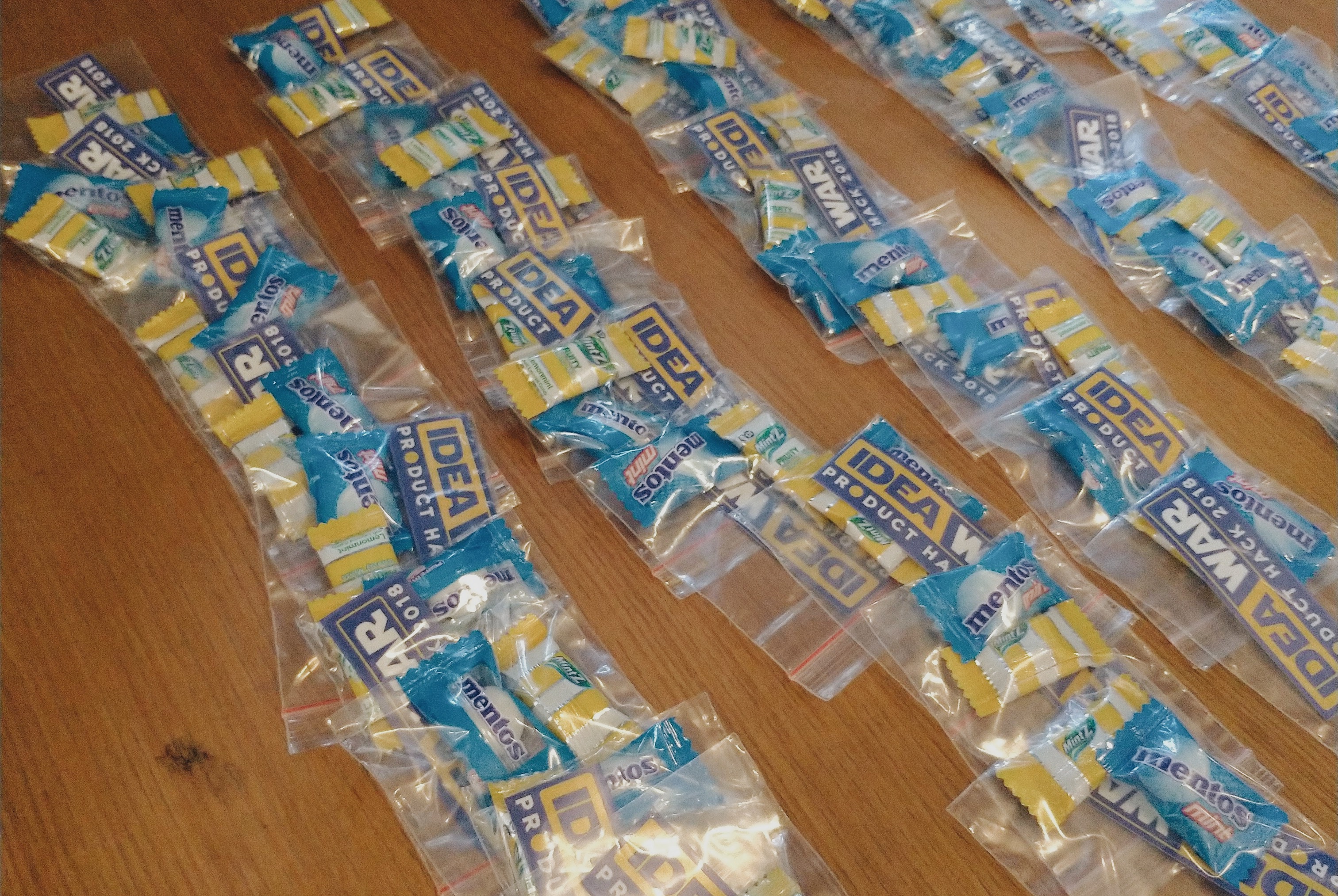
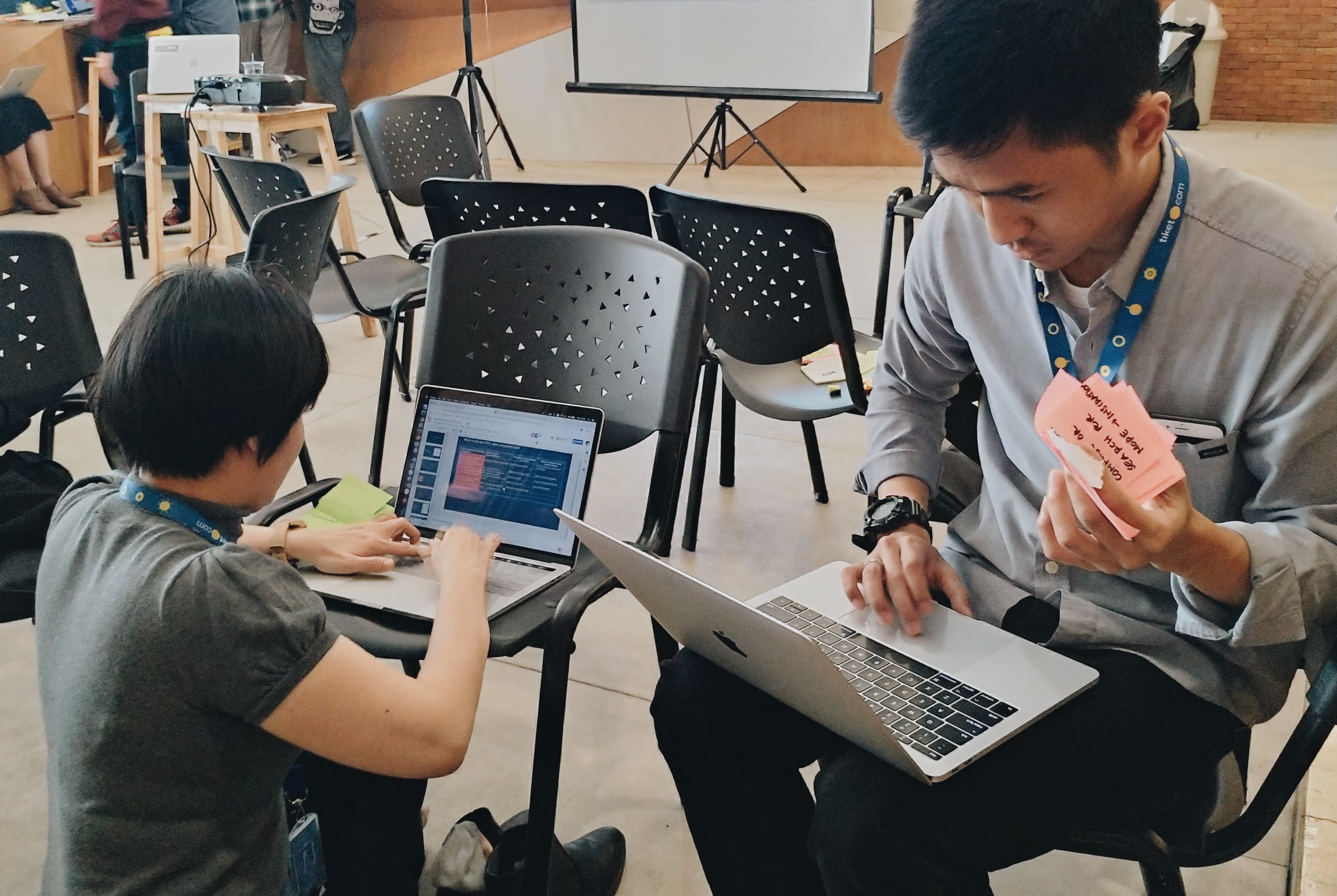
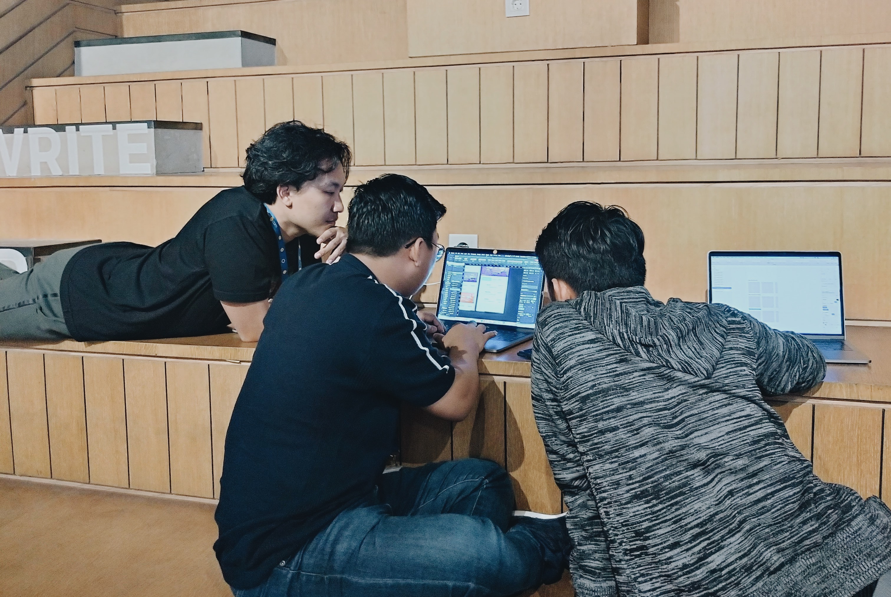
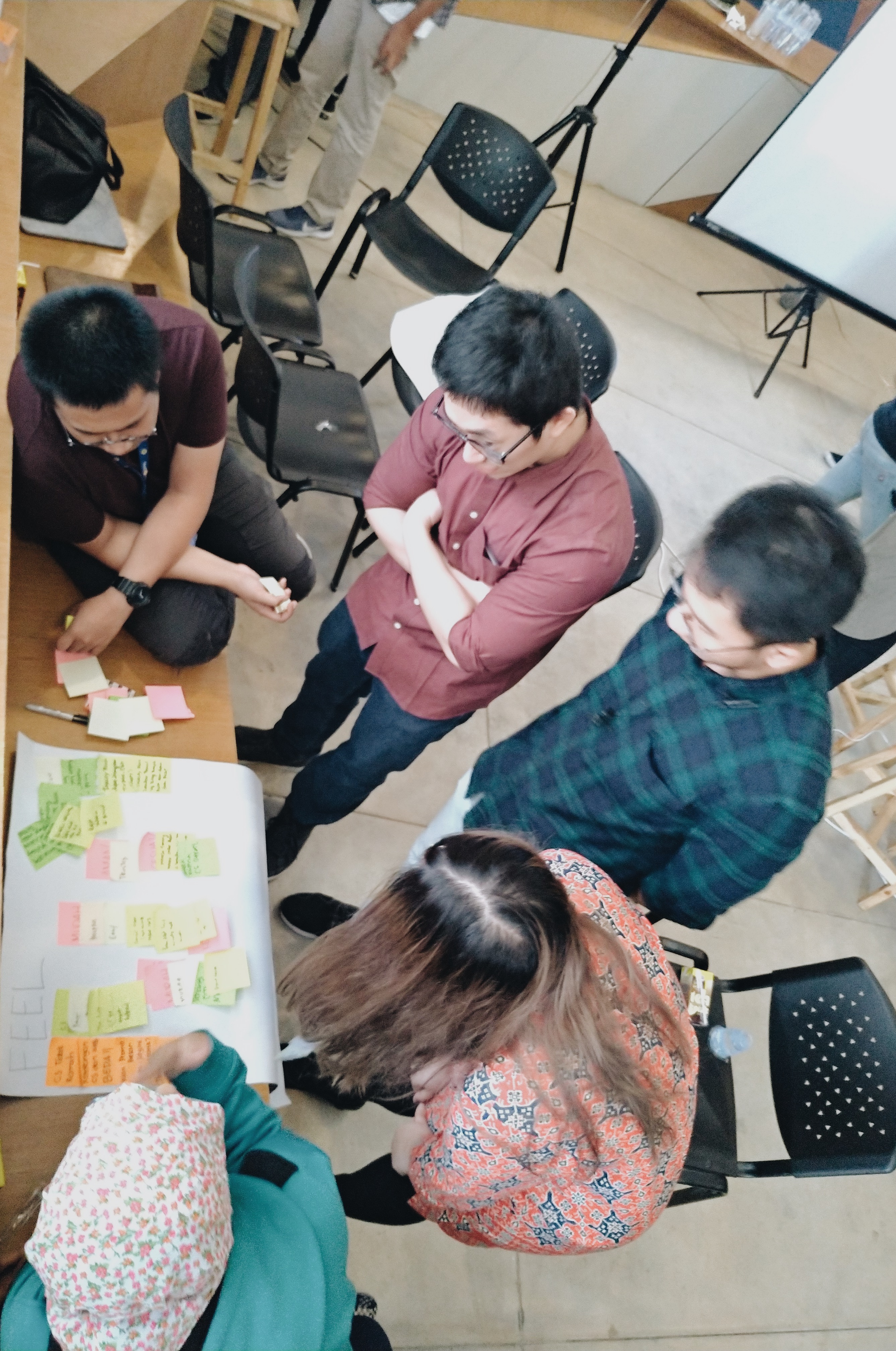
My recent collaboration at tiket.com with UX Researchers and Designers, a star wars themed event, called Idea War - Product Hack 2018, where Product People of tiket.com spent 2 days battling their ideas for a better product in 2019.
Introduction
Product Hack is a home where Product people could express their passion through events. The first event was Idea War, an ideation workshop, where Product people and several friends from other divisions learn to ideate rapidly and have a place to gather their extraordinary ideas for tiket.com in 2019.
Product people are looking forward to seeing in 2019 more product managers, UI and UX designers and researchers contributing their ideas to tiket.com. Most importantly, nurturing productive-communication amongst team and increasing sense of belonging.
Product people are looking forward to seeing in 2019 more product managers, UI and UX designers and researchers contributing their ideas to tiket.com. Most importantly, nurturing productive-communication amongst team and increasing sense of belonging.
Venue, Agenda and Attendees
The first Idea War was held on 19th-20th December 2018, located at Kawung Room, Grha Niaga Thamrin 6th floor. This event was attended by around 45 people from different roles, including: product managers, UI and UX designers, UX researchers, engineers and also data scientists.


Programme
First of all, this event is named Idea War. But what is ideation? According to some of point of views, ideation is a structured process guiding people through a number of exercise to come up with innovative ideas. The process itself would be better if the attendees come from multi-disciplinary or even multi-cultural people. Doing so would produce more innovative and creative ideas for the community.
This event is expected to give three results as stated below.
This event is expected to give three results as stated below.
-
Vision ideas for product roadmap (the product roadmap 2019 is already discussed and well-planned),
-
Product growth metrics and,
-
Preliminary design concept.

The Double Diamond
Double diamond diagram/process was developed through in-house research at the Design Council in 2005 as a simple graphical way of describing the design process. This diagram was formed by four different stages: Discover, Define, Develop and Deliver.
The committee team split the 4 different stages in two days. Day-1 covered: Define and Develop stages, while Day-2 covered: Develop and Deliver stages
The committee team split the 4 different stages in two days. Day-1 covered: Define and Develop stages, while Day-2 covered: Develop and Deliver stages

1. Discover: How we discover the problem?
To start this stage, we chose Rapid Thinking method. Rapid thinking is about how to produce or generate ideas as many as possible in a short amount of time. This activity has the goal to challenge every participant to push their ability for idea production. Another goal of rapid thinking is so that each time people have an issue/problem/project to solve, they are familiar .
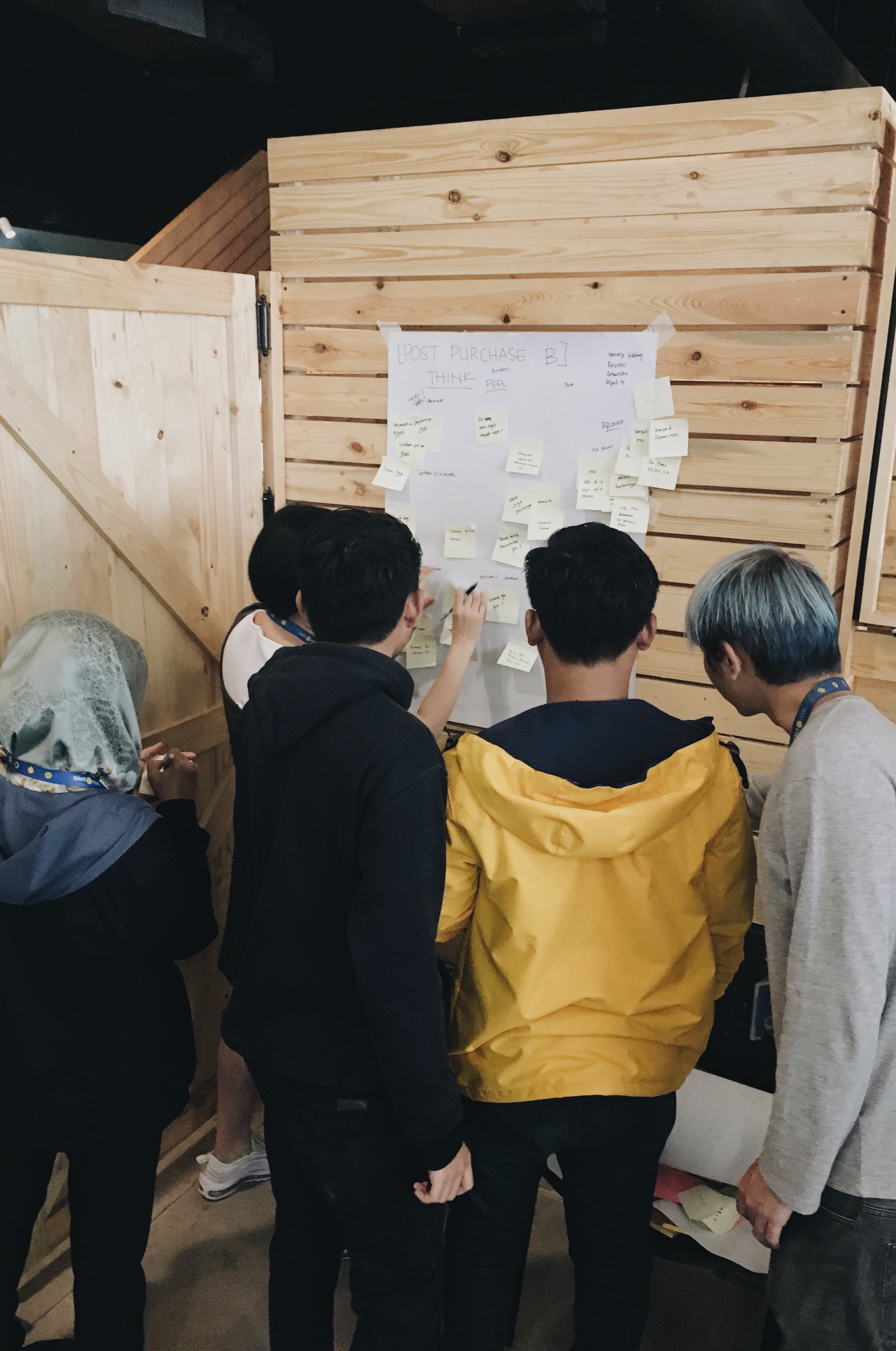
Before it was started, all of participants were divided into three groups. Each group represents different phase of tiket.com user experience (x’piration, consume and post-purchase).
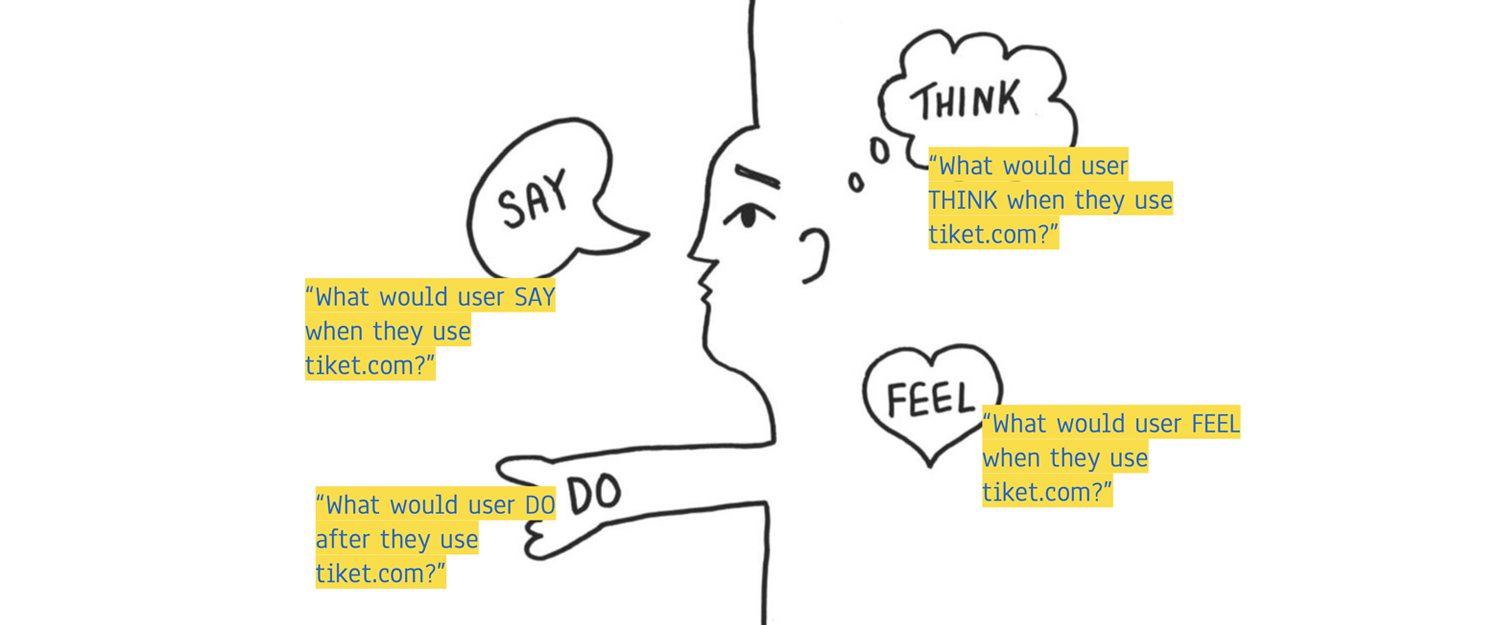
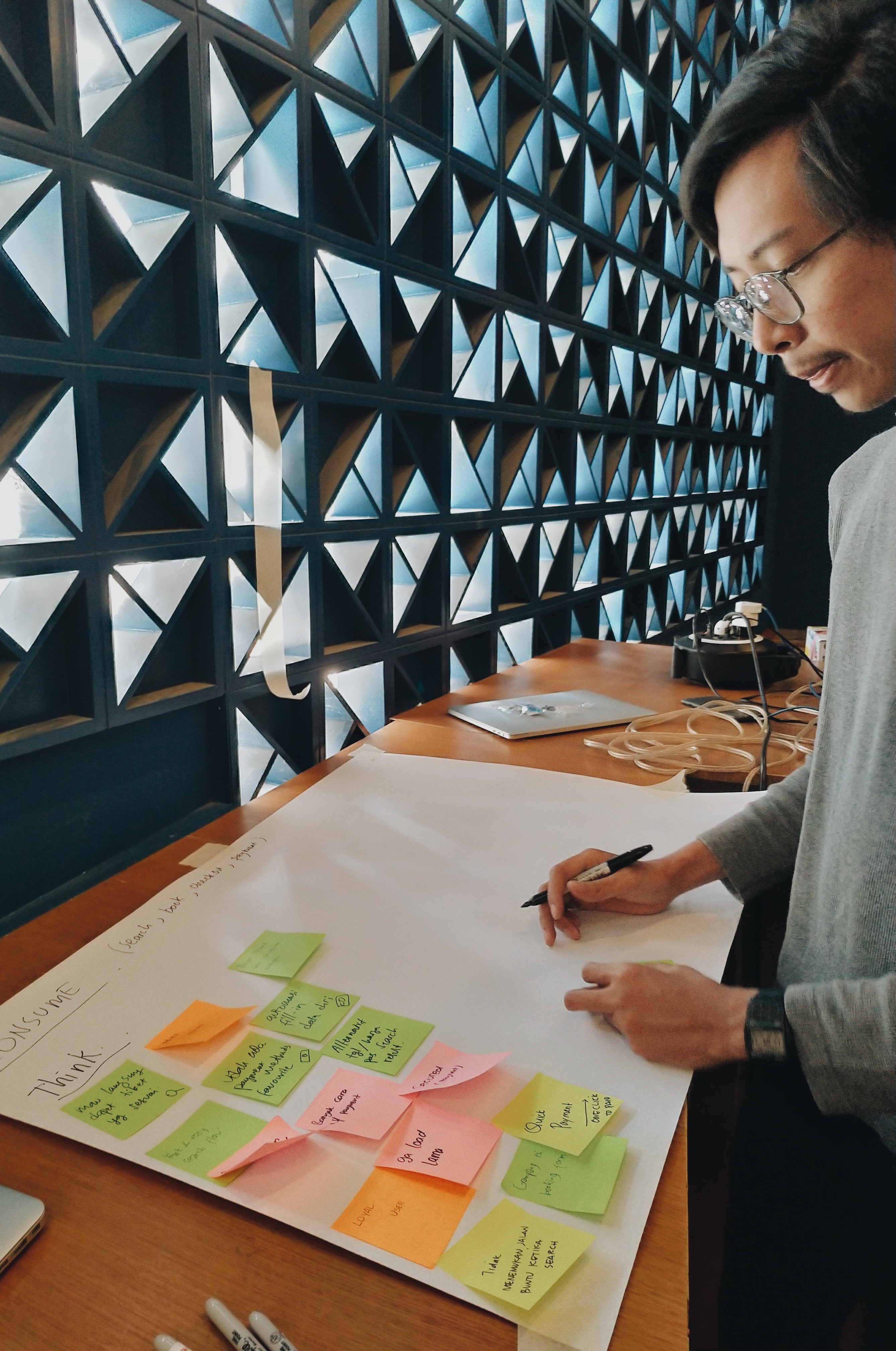
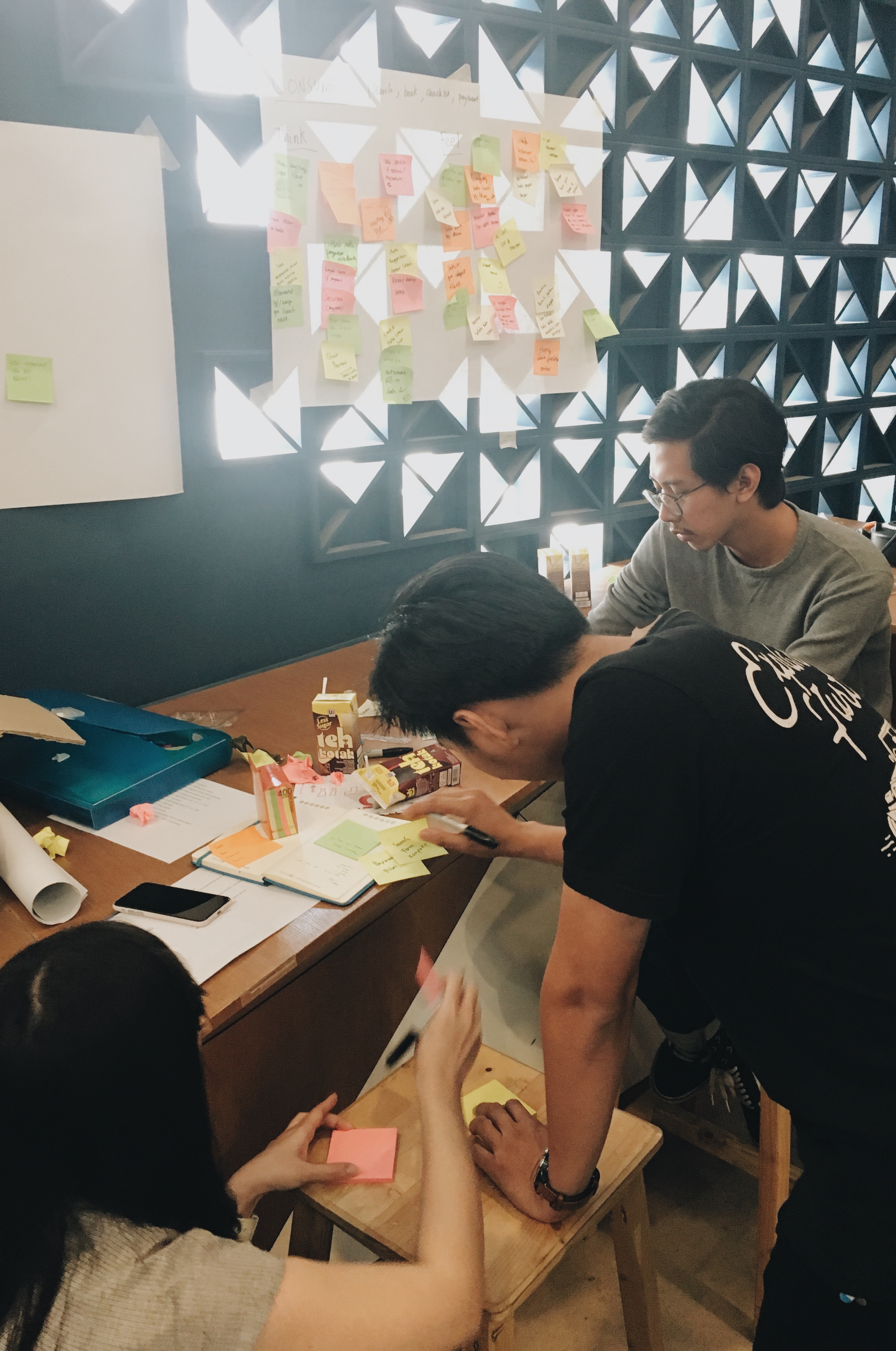
Next, we exercised Think Feel Say Do - Model. Actually Product people might be more familiar with this model as a user empathy map. This model is helpful for synthesizing research data in order to understand what user needs and wants. Each team asked them to go back to their group and start the rapid thinking stage by stage. Each stage should be completed by 5 minutes of bombing ideas > 5 minutes of discussing the ideas > 2 minutes of presentation.
Before it was started, all of participants were divided into three groups. Each group represents different phase of tiket.com user experience (x’piration, consume and post-purchase).
Next, we exercised Think Feel Say Do - Model. Actually Product people might be more familiar with this model as a user empathy map. This model is helpful for synthesizing research data in order to understand what user needs and wants. Each team asked them to go back to their group and start the rapid thinking stage by stage. Each stage should be completed by 5 minutes of bombing ideas > 5 minutes of discussing the ideas > 2 minutes of presentation.
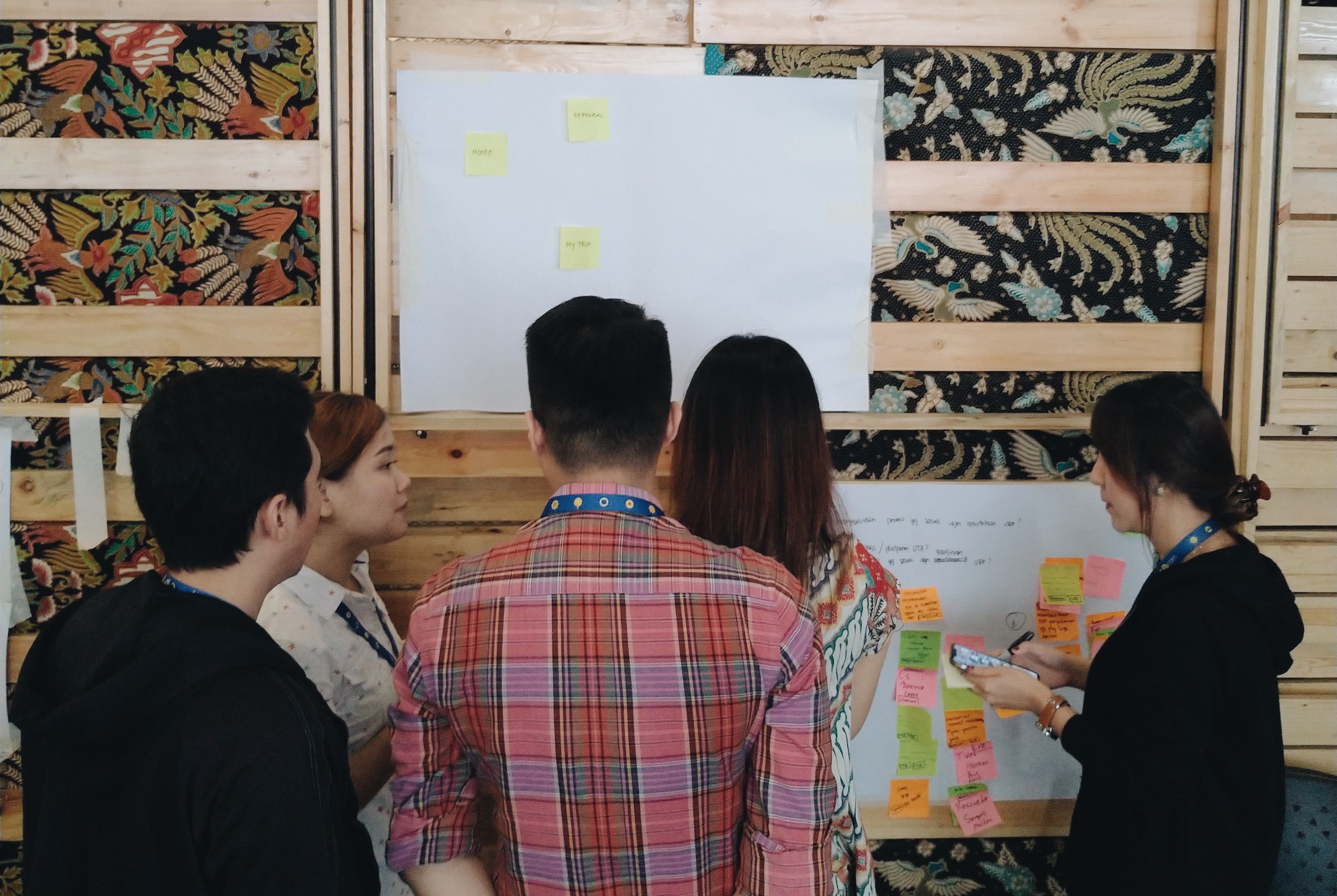
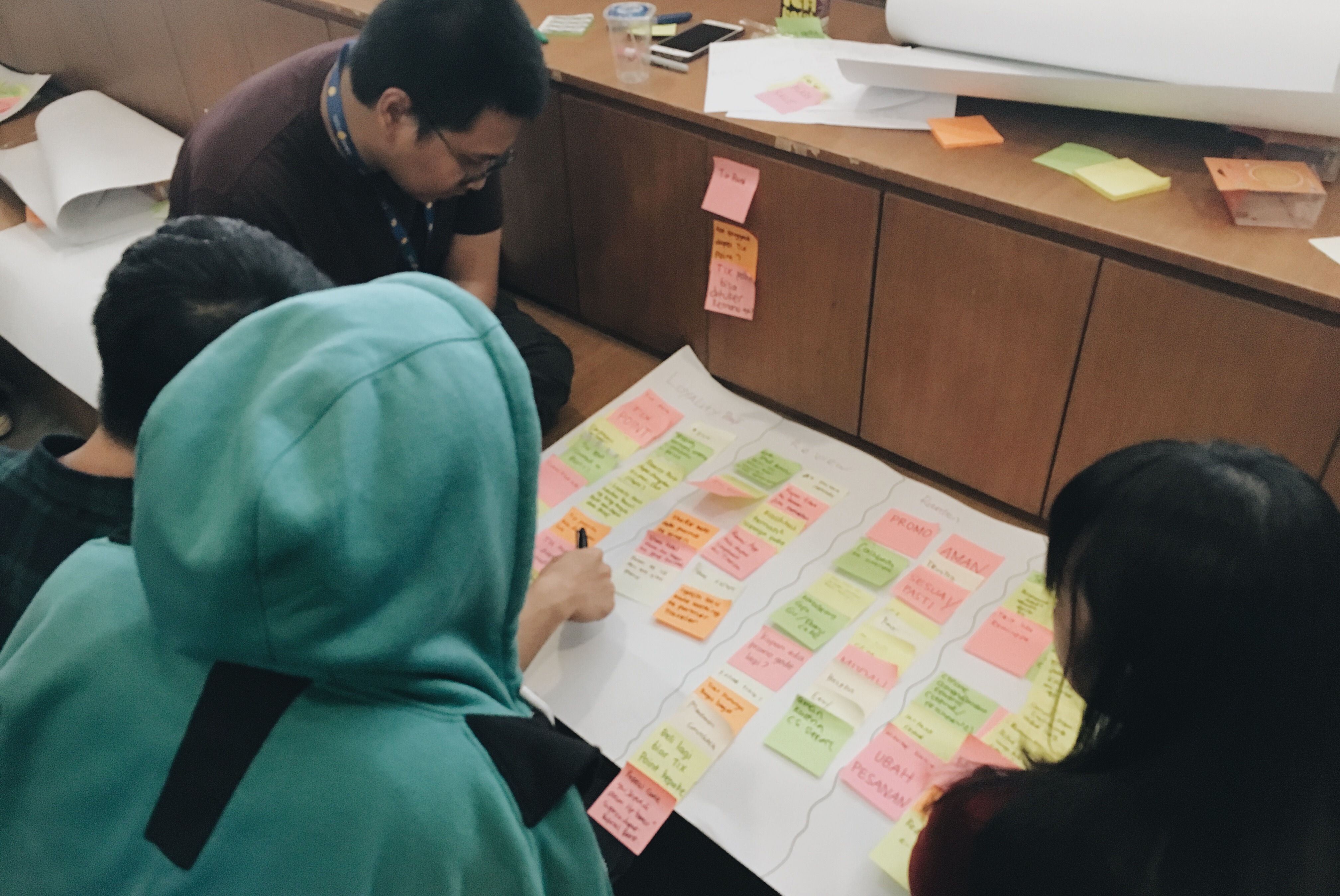
2. Define: How we define the problems to map out set of solutions?
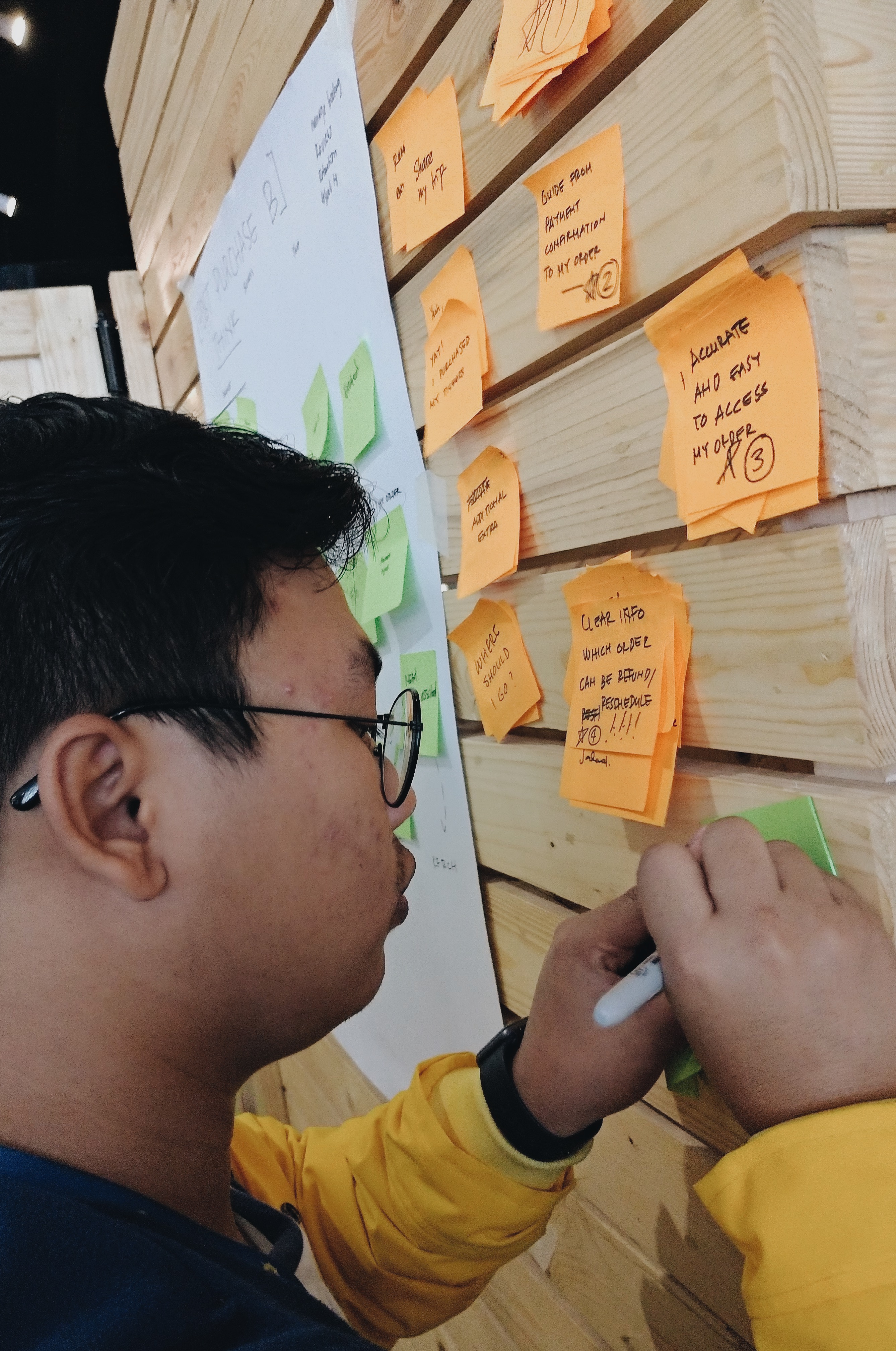
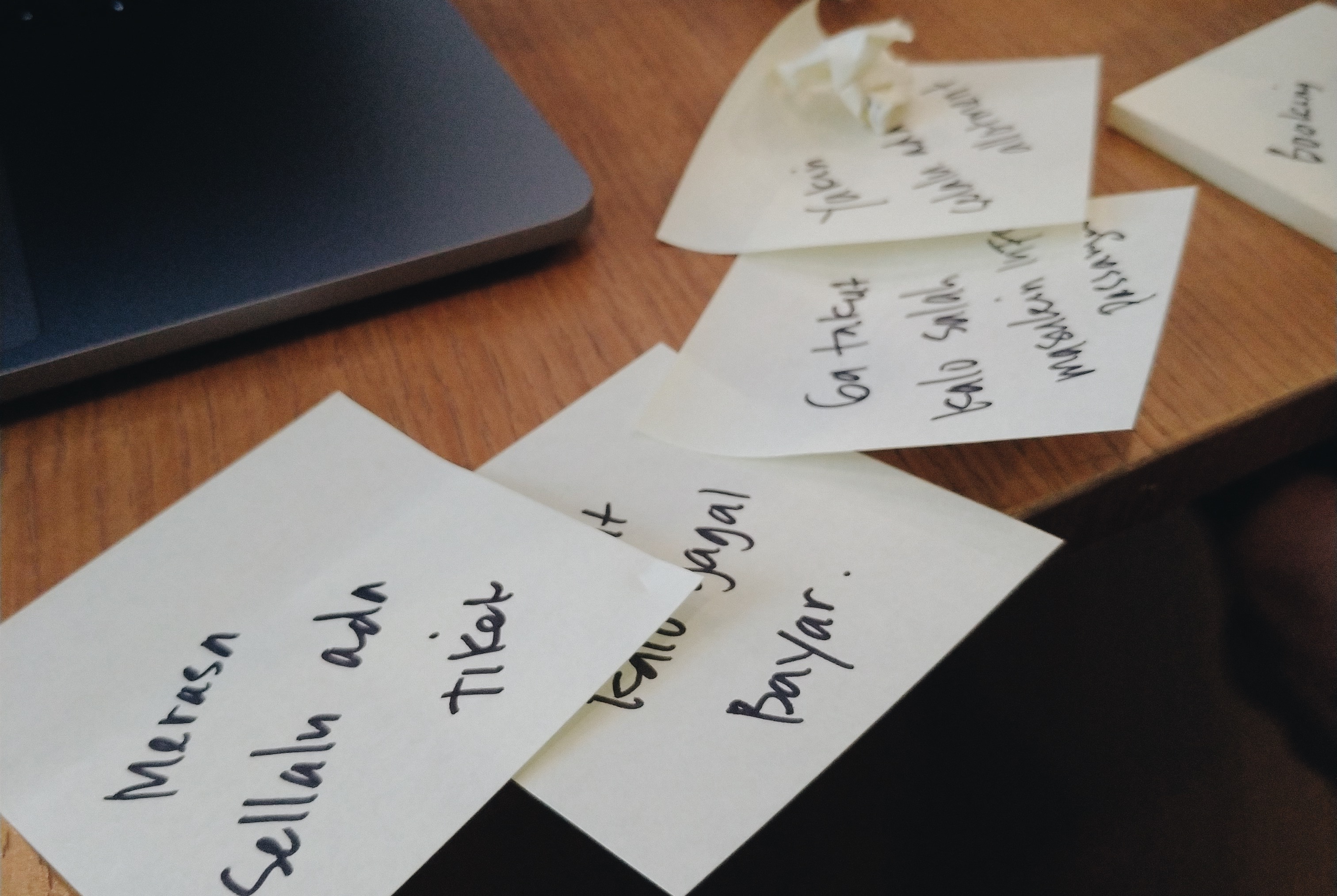
After finishing 4 rounds of rapid thinking, hundreds of statements were sticked and cluttered. Product people needed a tool to define them, what are those? What is the connection? Is it clausal statement?, etc.
Hence, we use affinity diagram, a tool to generate, organise and consolidate information concerning a product, process, complex issue, or problem. The diagram was created in the 1960s by Kawakita Jiro is also known as the KJ method.
When to use affinity diagram? Normally, it helps when issues seem too large and complex to explain, coach how to cluster and bundle ideas and facts, make the groups of ideas into conceptual framework.
At the end of this stage, each group should make maximum 3 problem statements. Then from each problem statement, every group should produce as many as possible solutions.


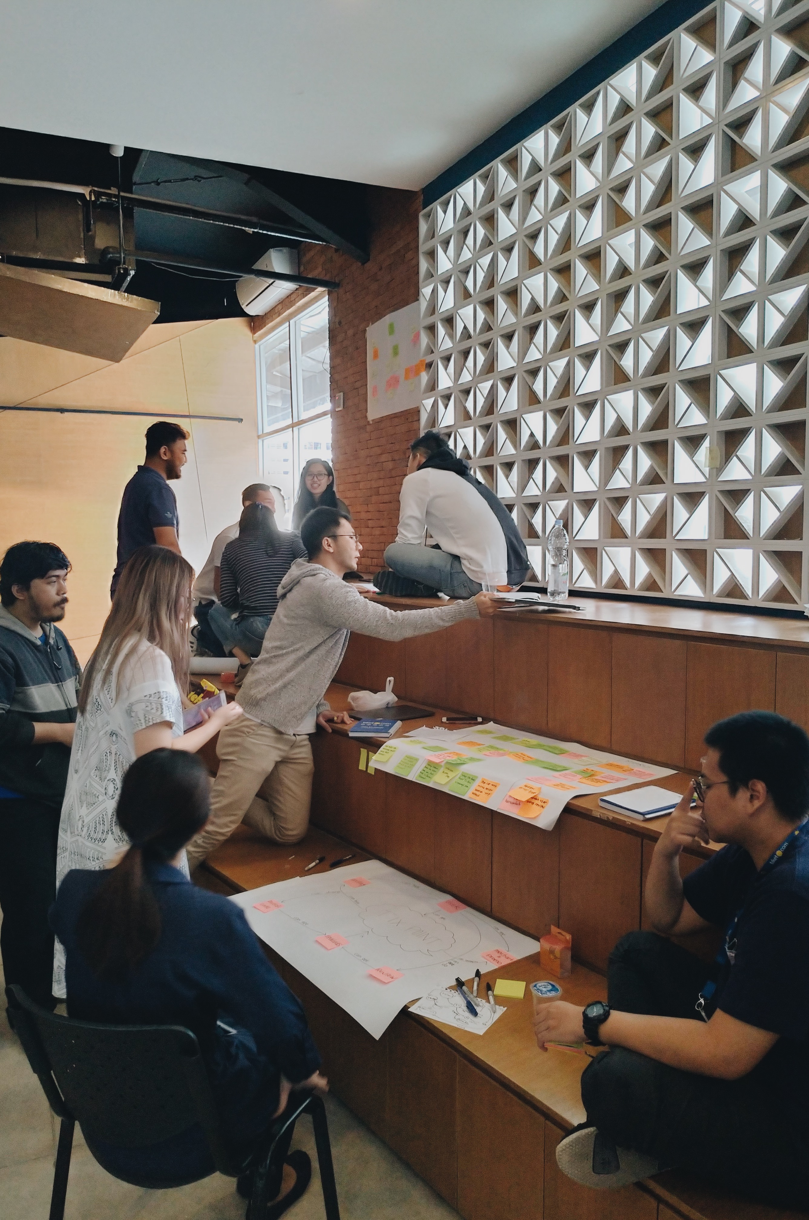
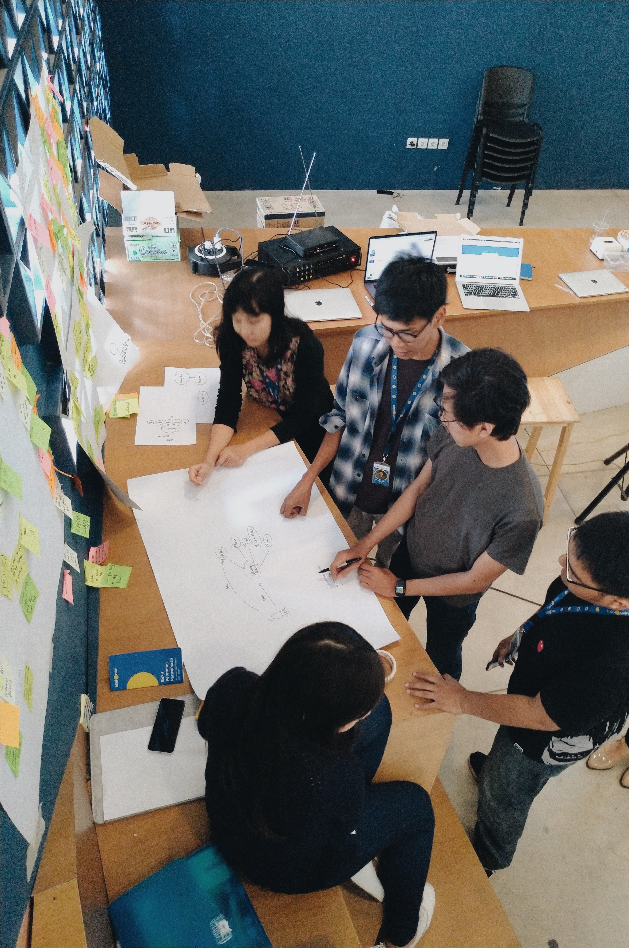
3. Develop: How we develop our set of solutions to be more concrete?
At this stage, activities are designed to map participants’ solution ideas to be more concrete.
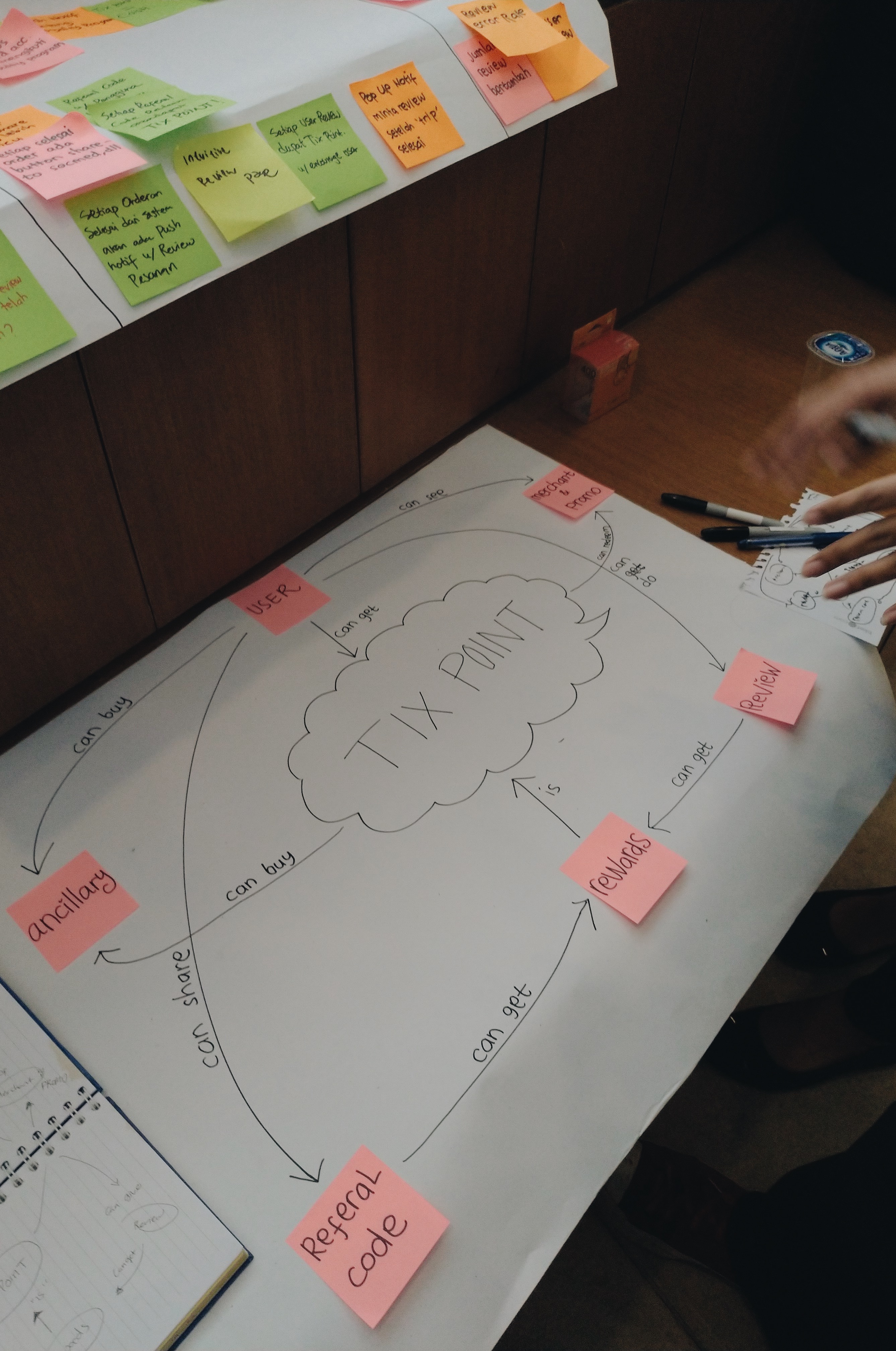
Concept Model. “Is a visual representation to help you understand the different kinds of information that your product needs to display.” - boxesandarrows.com. A concept model is to help teammates, users and yourself understand how the site/feature actually works. An example of concept model might help.
![]()
(Path concept model made by one of tiket.com UX Designers: Muhammad Heikal)
Prototyping. Who doesn’t know about prototyping?Prototyping is very important to design process. A prototype should help team evaluating and testing the proposed idea or design. Making a prototype usually also clarify production issues and costs.
Each team should make their own prototype. It can be a low fidelity prototype by only using drawings on paper or even a high fidelity prototype completed with the UI. This is possible because each group has at least one designer, who could help to visualise the idea to be a prototype.
Concept Model. “Is a visual representation to help you understand the different kinds of information that your product needs to display.” - boxesandarrows.com. A concept model is to help teammates, users and yourself understand how the site/feature actually works. An example of concept model might help.
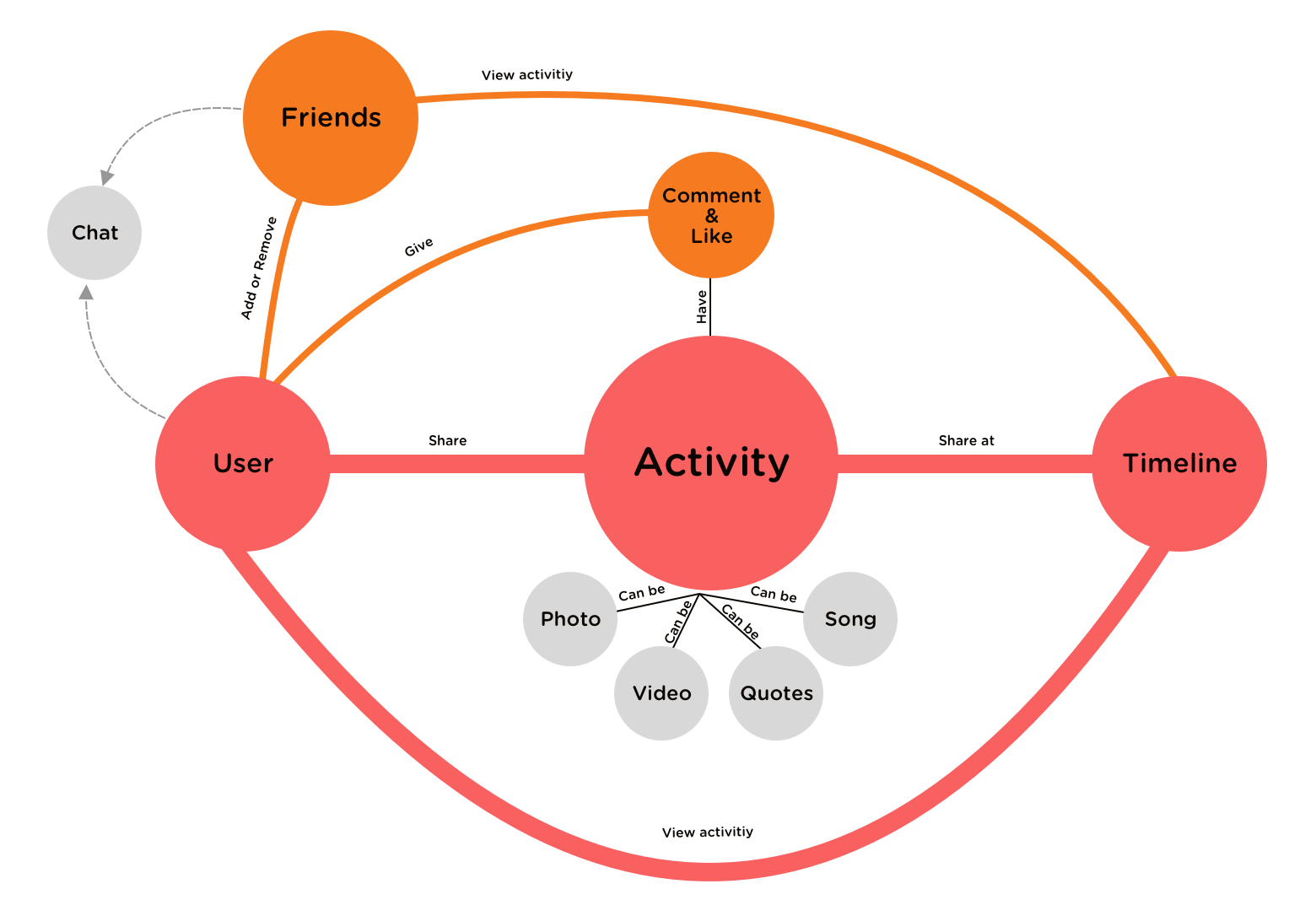
(Path concept model made by one of tiket.com UX Designers: Muhammad Heikal)
Prototyping. Who doesn’t know about prototyping?Prototyping is very important to design process. A prototype should help team evaluating and testing the proposed idea or design. Making a prototype usually also clarify production issues and costs.
Each team should make their own prototype. It can be a low fidelity prototype by only using drawings on paper or even a high fidelity prototype completed with the UI. This is possible because each group has at least one designer, who could help to visualise the idea to be a prototype.


4. Deliver: How we produce the product where it is finalised and launched in the relevant market?
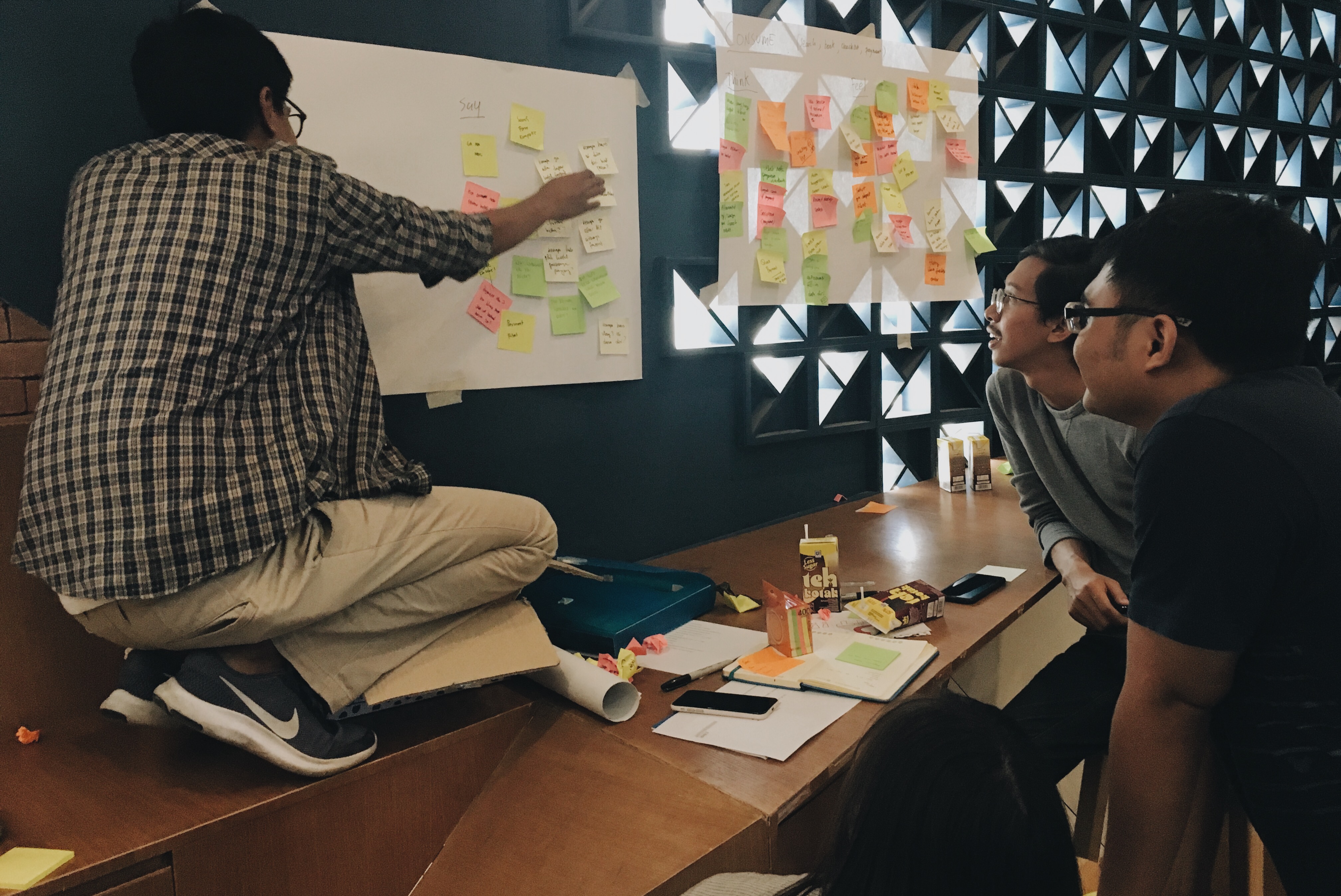
The usability testing. Previously, every group should finish their prototype. Next activity was to test them. The importance of doing UT is we could get early feedbacks before the product is ready to launch. Each group needed to find at least 5 testers to try on their prototype.
Compiling all the works. Each team were required to prepare their final presentation for the final war. It could be a presentation, a video, or anything. They should include all of the processes they have been through, from beginning to end. What were their problem statements, how did they approach it, what did they propose to solve the problems, their concept model, and finally their result after the prototype was tested.
Compiling all the works. Each team were required to prepare their final presentation for the final war. It could be a presentation, a video, or anything. They should include all of the processes they have been through, from beginning to end. What were their problem statements, how did they approach it, what did they propose to solve the problems, their concept model, and finally their result after the prototype was tested.

The final presentation. The War begins.
Finally the war began. Each group presented their process and the result, started by explaining their problem statements, selected solutions, the concept model and showing the UT result.
The war was thrilling! Everyone was excited and tried to convince others that they were delivering the greatest idea. After all of the groups finished the presentation, all of the people gathered to vote and find the winner.
The war was thrilling! Everyone was excited and tried to convince others that they were delivering the greatest idea. After all of the groups finished the presentation, all of the people gathered to vote and find the winner.


Future Recommendation
Idea War - Product Hack made Product people not only challenged them on ideation process, but also importantly they spent great time bonding to each other. These kind of activities are good to be implemented regularly for every project, where team could push their best and involve more perspectives to result better product. On the next idea war, more methods of thinking and ideation process should be applied, we might try design thinking or design sprint.
As a UX Researcher, personally, I recommend this kind of activity not only for Product division on a tech company, but also it was really good for different division to be familiar with ideation process. We just might not realised yet, how important design thinking on everything is. So, what’s next?
As a UX Researcher, personally, I recommend this kind of activity not only for Product division on a tech company, but also it was really good for different division to be familiar with ideation process. We just might not realised yet, how important design thinking on everything is. So, what’s next?
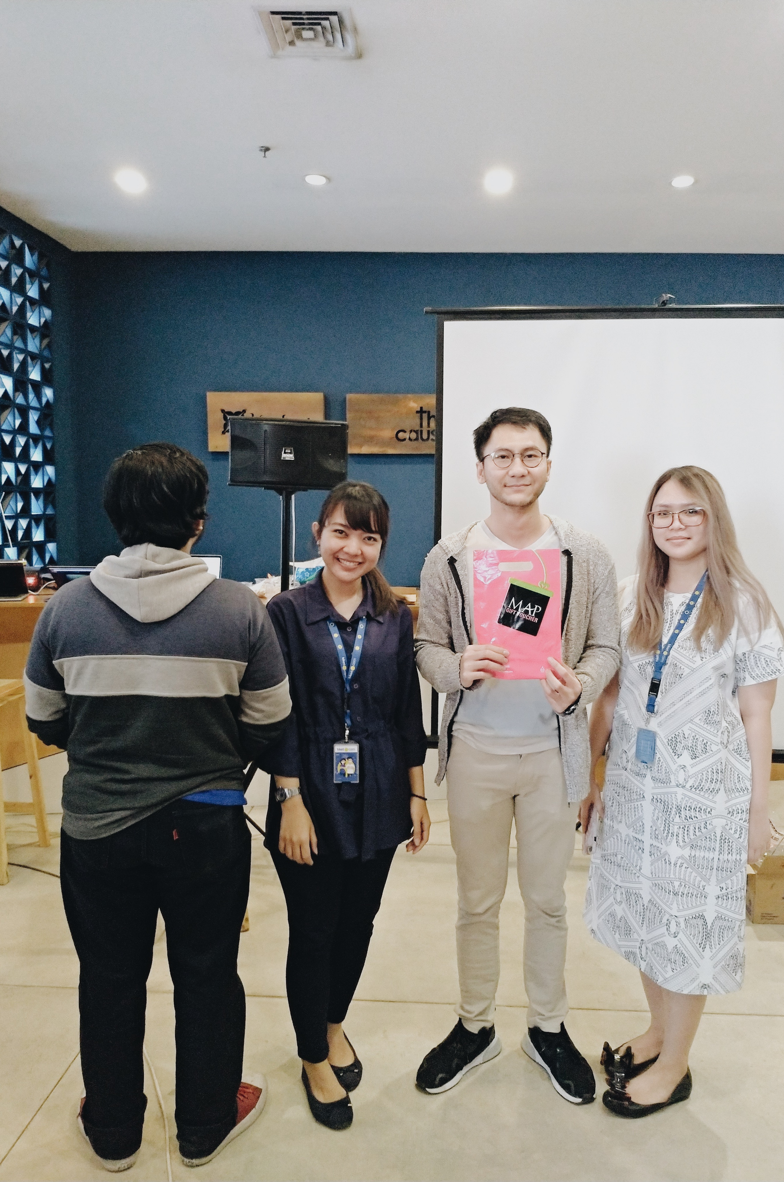
Last but not least, the winner is here!
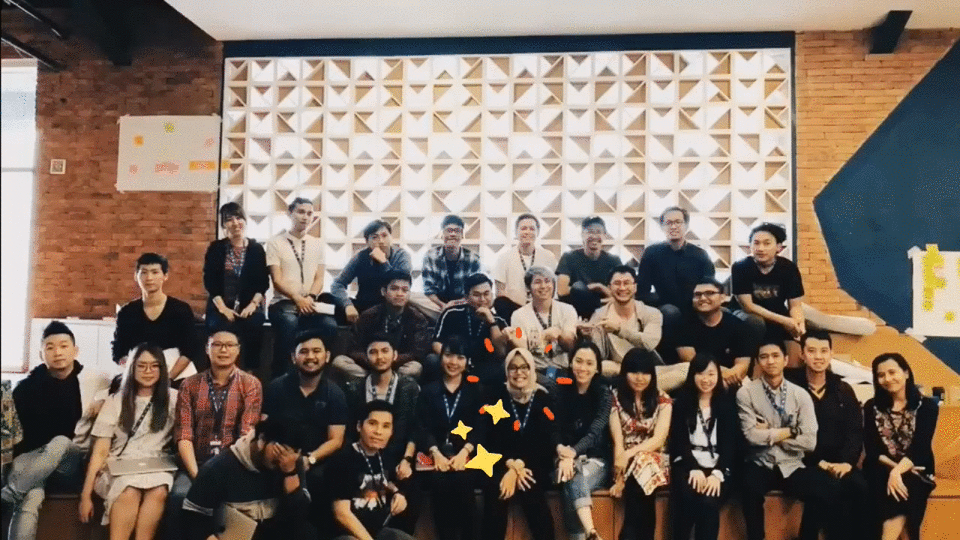
Spot me with the amazing people at tiket.com.
and also thanks to these fellows, awesome UX designers and researchers, who have always helped me in this event.
(Yeremia Yudha, William Stefan and Michael Lioe)
The User Experience - Vidio.com
June 2018
Researcher: Meidirasari Putri
Early 2018, Vidio.com just had a refreshment for its brand and the whole team decided to bring Vidio.com to be the greatest Online Video Platform, which delivers the curated-qualified contents and the biggest TV Market place in Indonesia.
This project aims to create The User Experience Map that should help Product teams in exploring user needs while accessing Vidio.com.
Research Question:
What do the users need exactly while accessing Vidio.com (especially for Sport Addict and Drama Addict users)?
Methods
Research type:
Tools:
This project aims to create The User Experience Map that should help Product teams in exploring user needs while accessing Vidio.com.
Research Question:
What do the users need exactly while accessing Vidio.com (especially for Sport Addict and Drama Addict users)?
Methods
Research type:
- Quantitative
- Qualitative
- Explorative
Tools:
- Trend review
- Brainstorming and UX Map Exercise
- Survey and User Interview
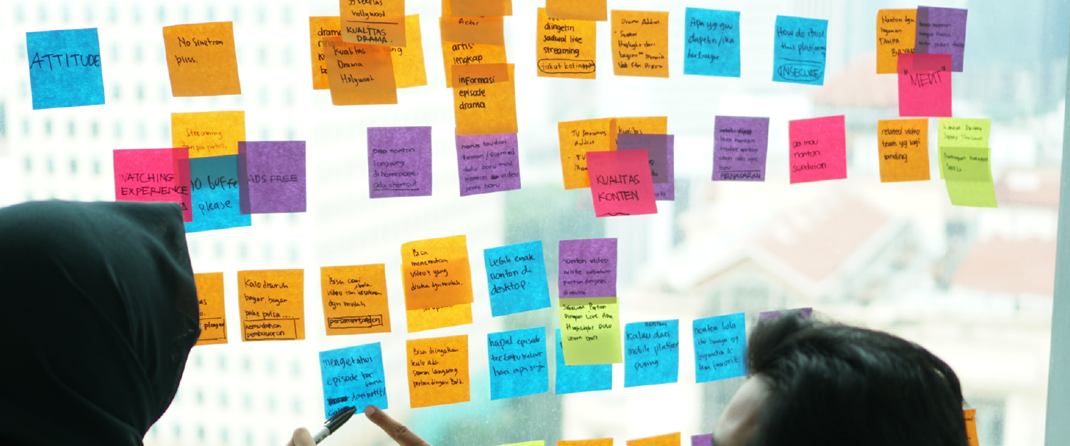
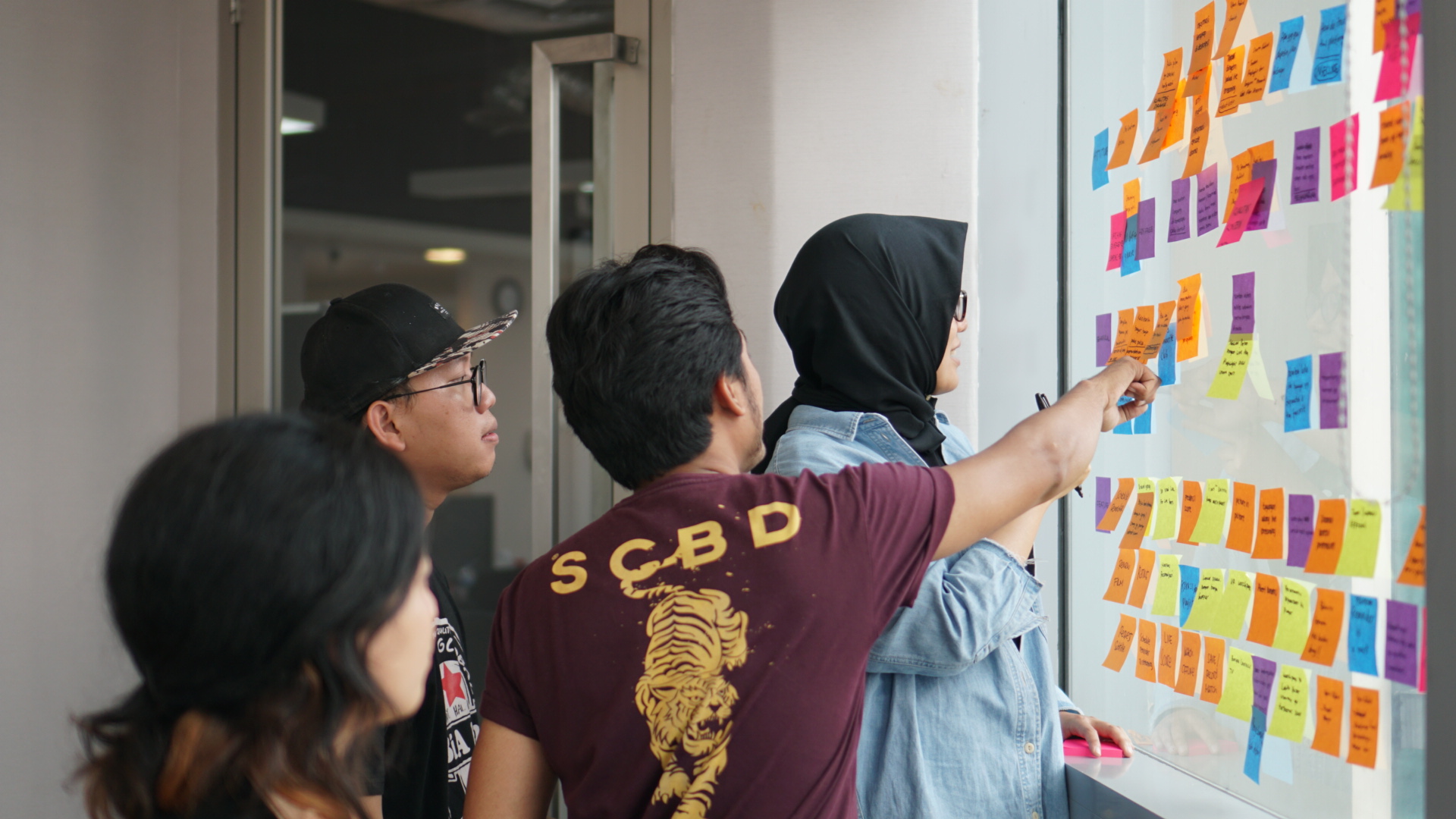
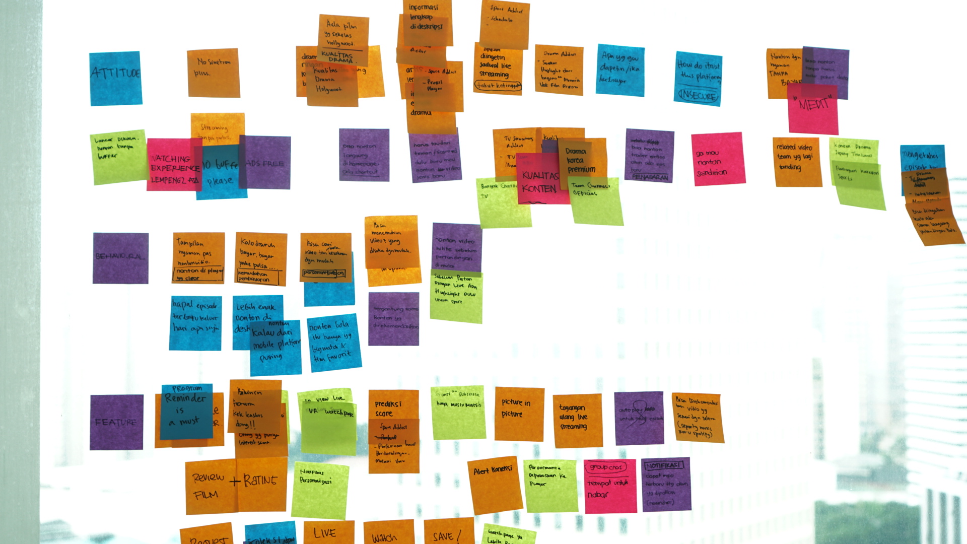
UX Map Exercise
Dump you assumptions!
A workshop has been conducted to gather all of our assumptions to be validated to real users. All of ideas were grouped into three parts: Attitude, Behavioural and Feature.

Data Collection
Survey
At the mean time, team also have blasted the survey through social media to : Vidio.com super users, Vidio.com loyal users and all Vidio.com users.
This kind of survey aims to not only for gathering personal and user behaviour data, but also to invite them participating in Vidio.com product development.
This kind of survey aims to not only for gathering personal and user behaviour data, but also to invite them participating in Vidio.com product development.
User Interview
A set of guideline discussion prepared for user interview. Selected users from previous survey were invited to join product discussion.
Data Analytic Team
We also get a lot of help from Data Analyst team to gather user data through Google Analytic.
What data said about the users?
- The majority of users are people who like to watch Live Streaming (Event and TV)
- Push Notifications bring great impact to influece users watching from Vidio.com
- Several factors that persuade users spending time on Vidio.com: show/video duration, used quota while watching, watching moment.
- Users are familiar with the brand for watching local short movies.
- Most of users are not so sure if Vidio.com switchs to be more premium video platform.
- Returning sport addict users find that Live Chat feature are fun.

(UI/UX Team Vidio.com © June, 2018)
The Drama Addict
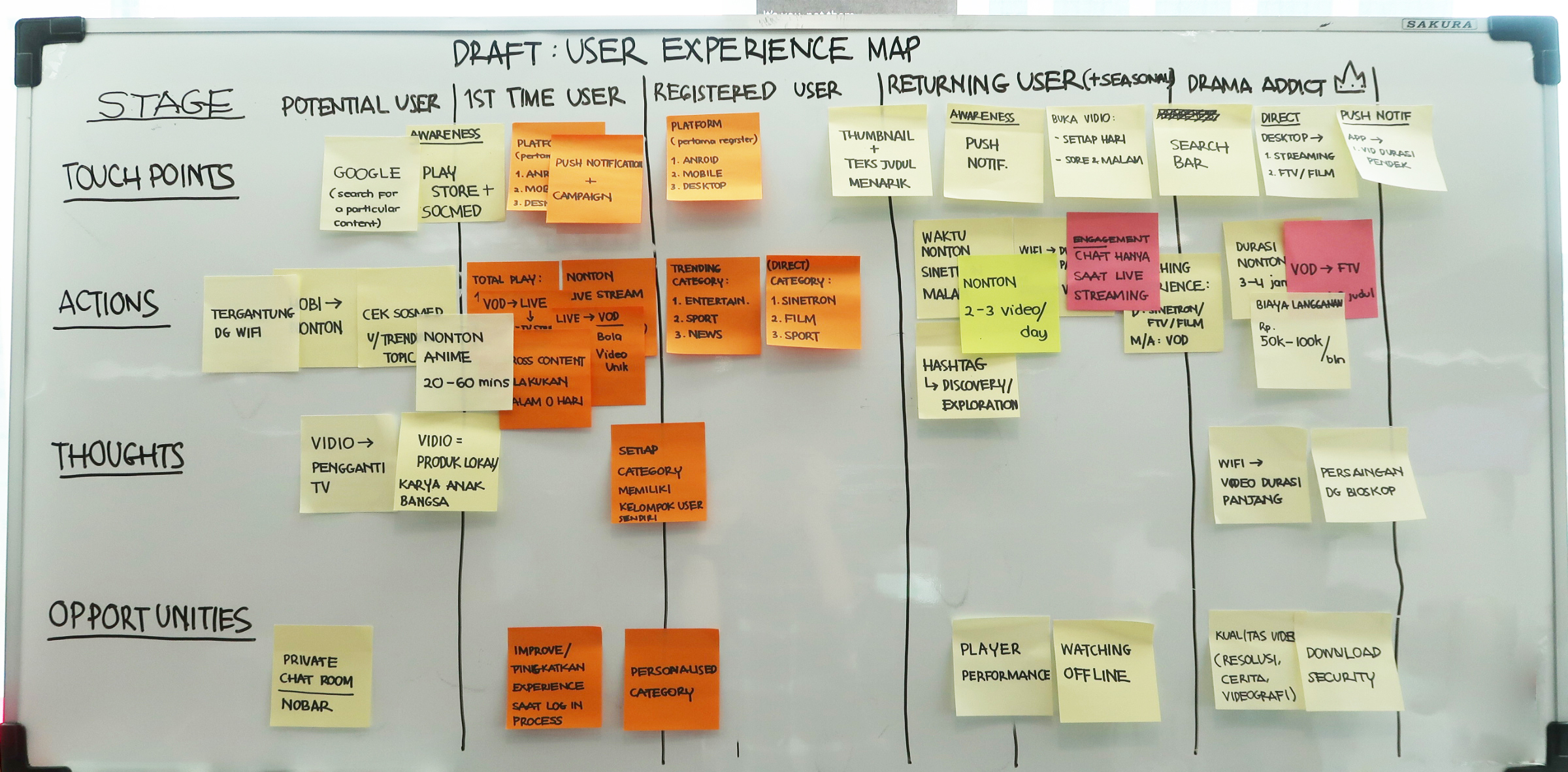 The Drafts
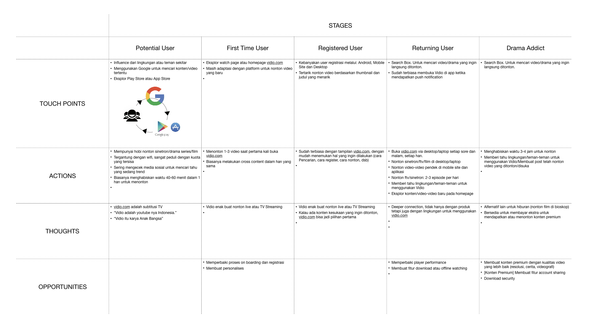
Drama Addict User Experience Map
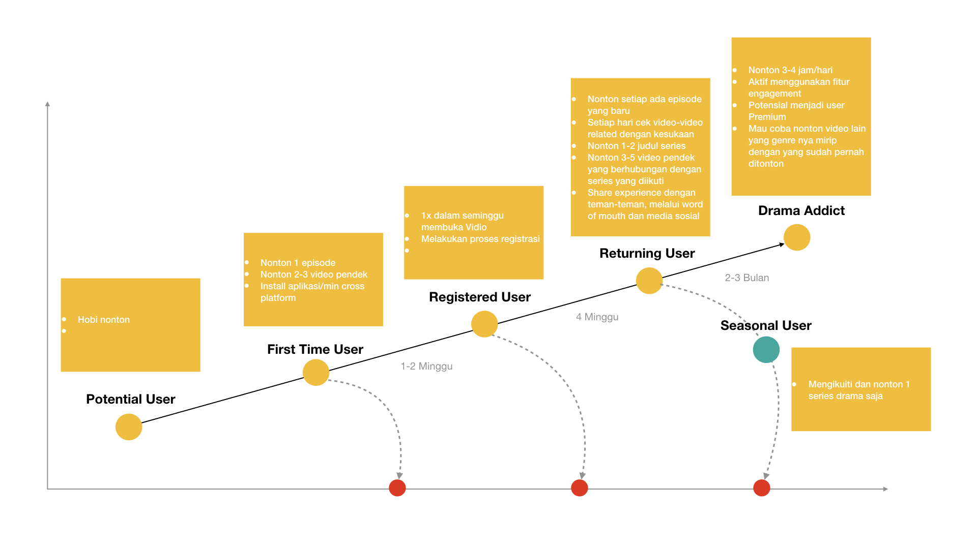
The Drama Addict User Maturity Level
The Sport Addict
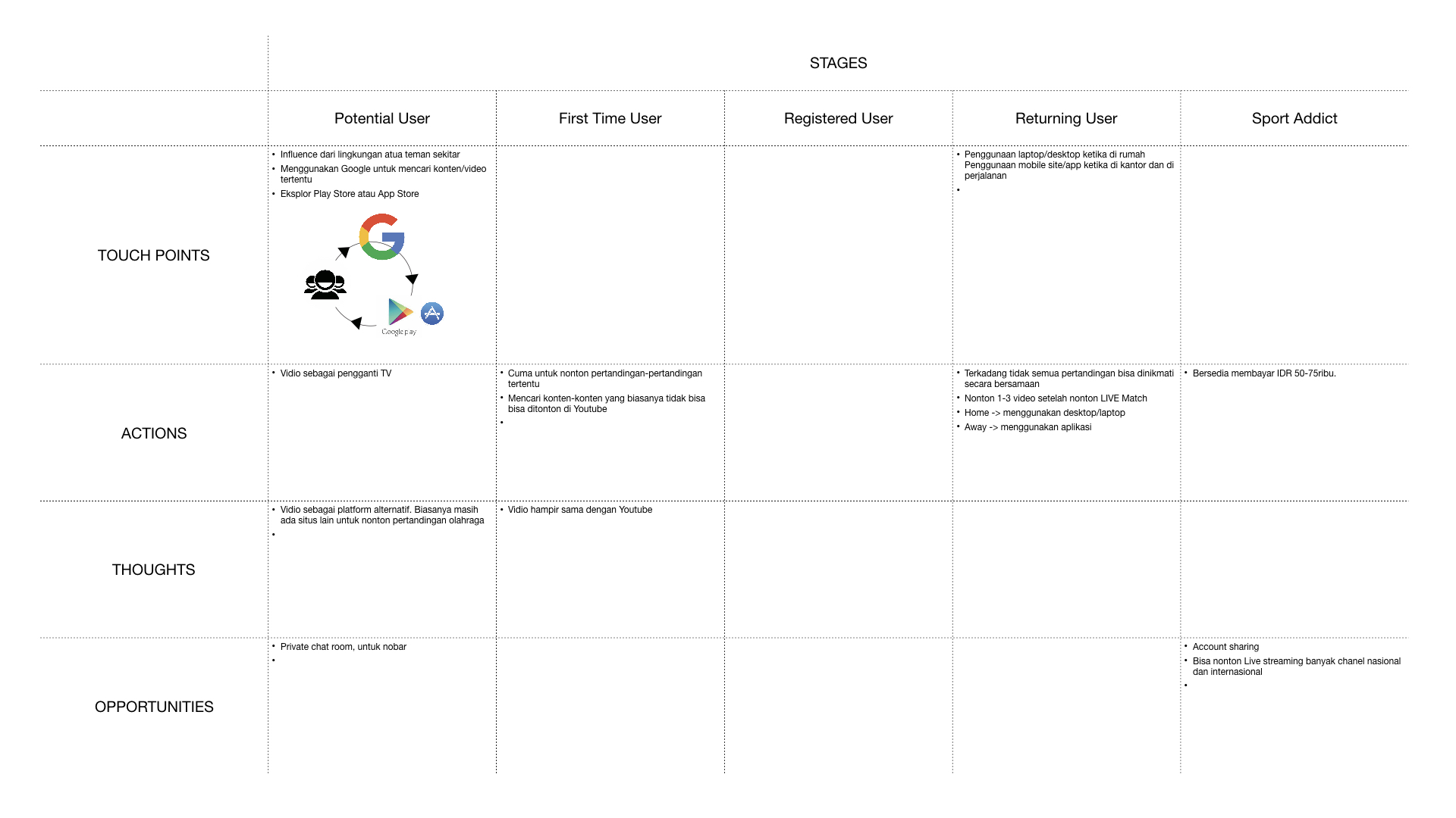
Sport Addict User Experience Map
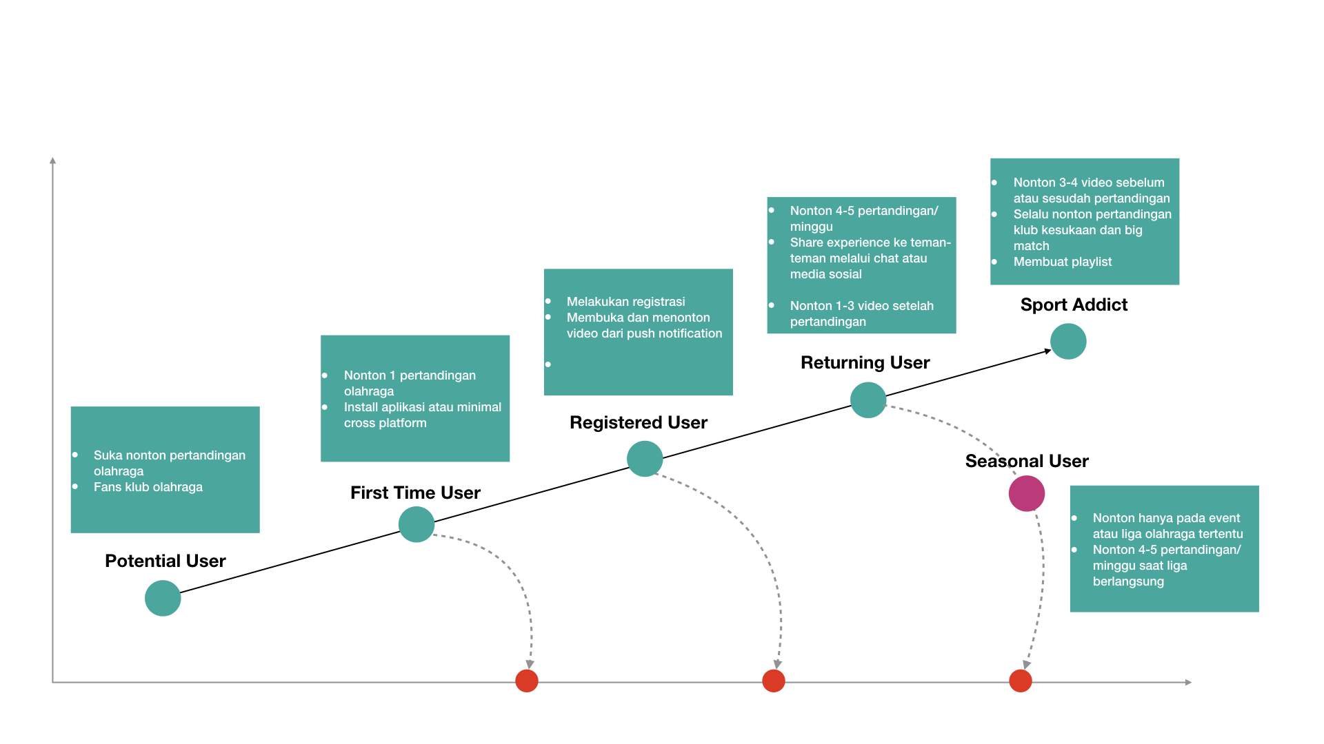
The Sport Addict User Maturity Level
So, what next?
After mapping all of the results on each user experience map, team might work more effectively. In this case, product team shoul point out the potentials, then prioritise them as stories on product development.
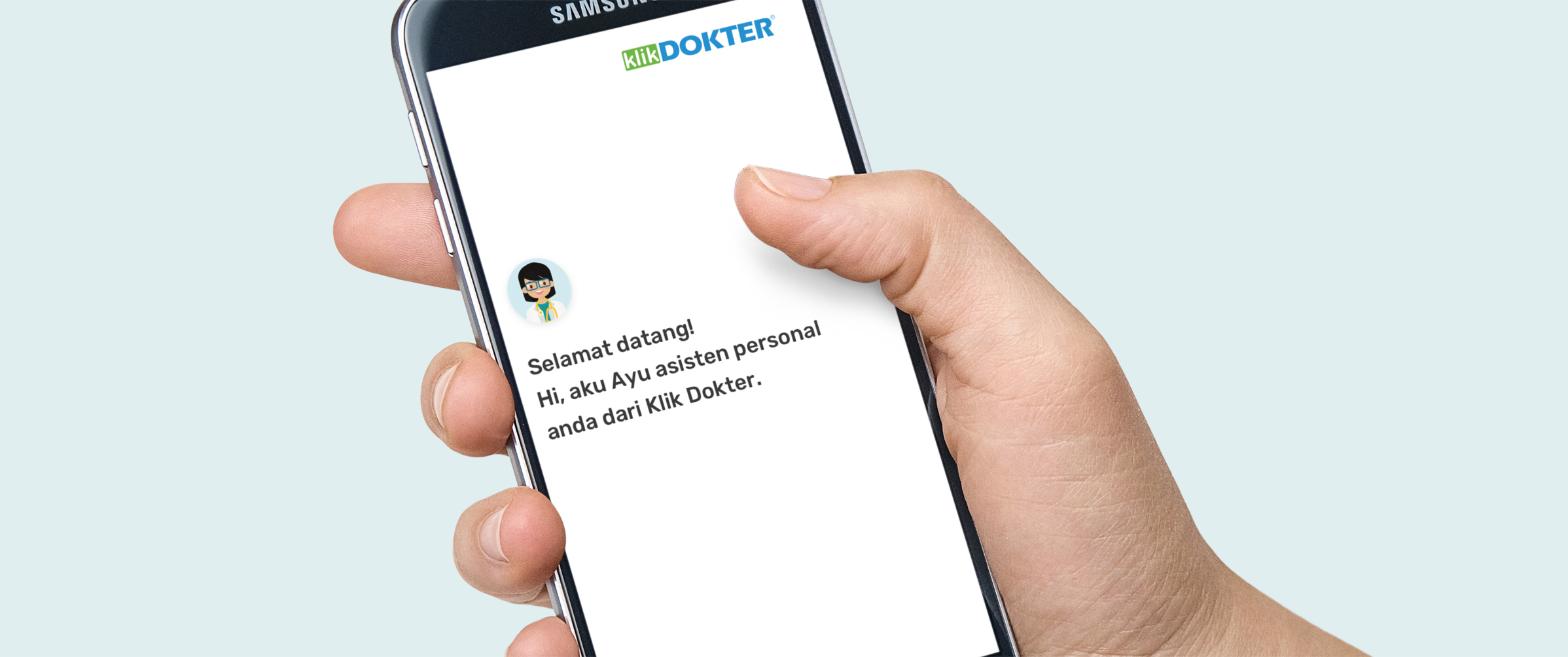
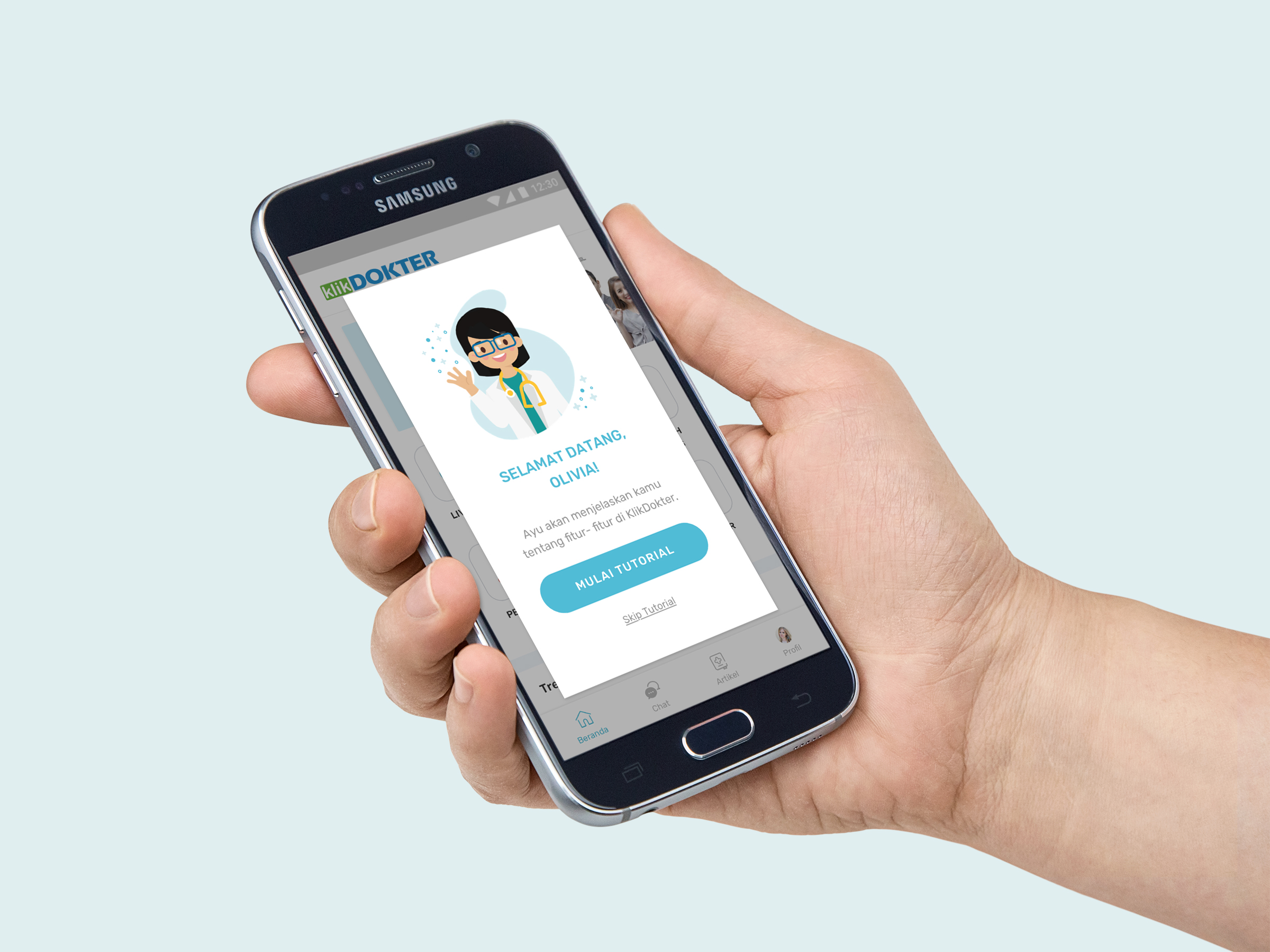
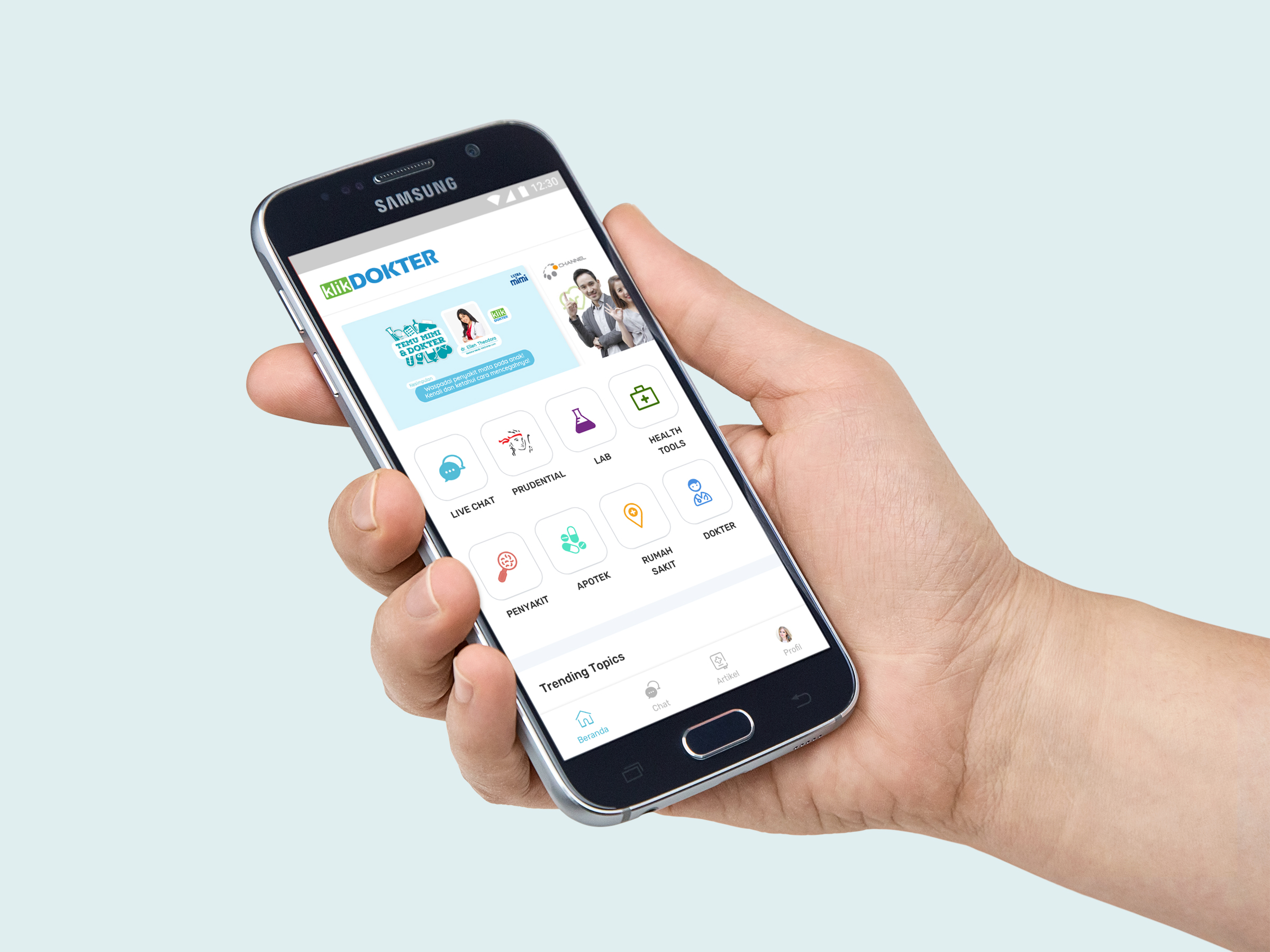
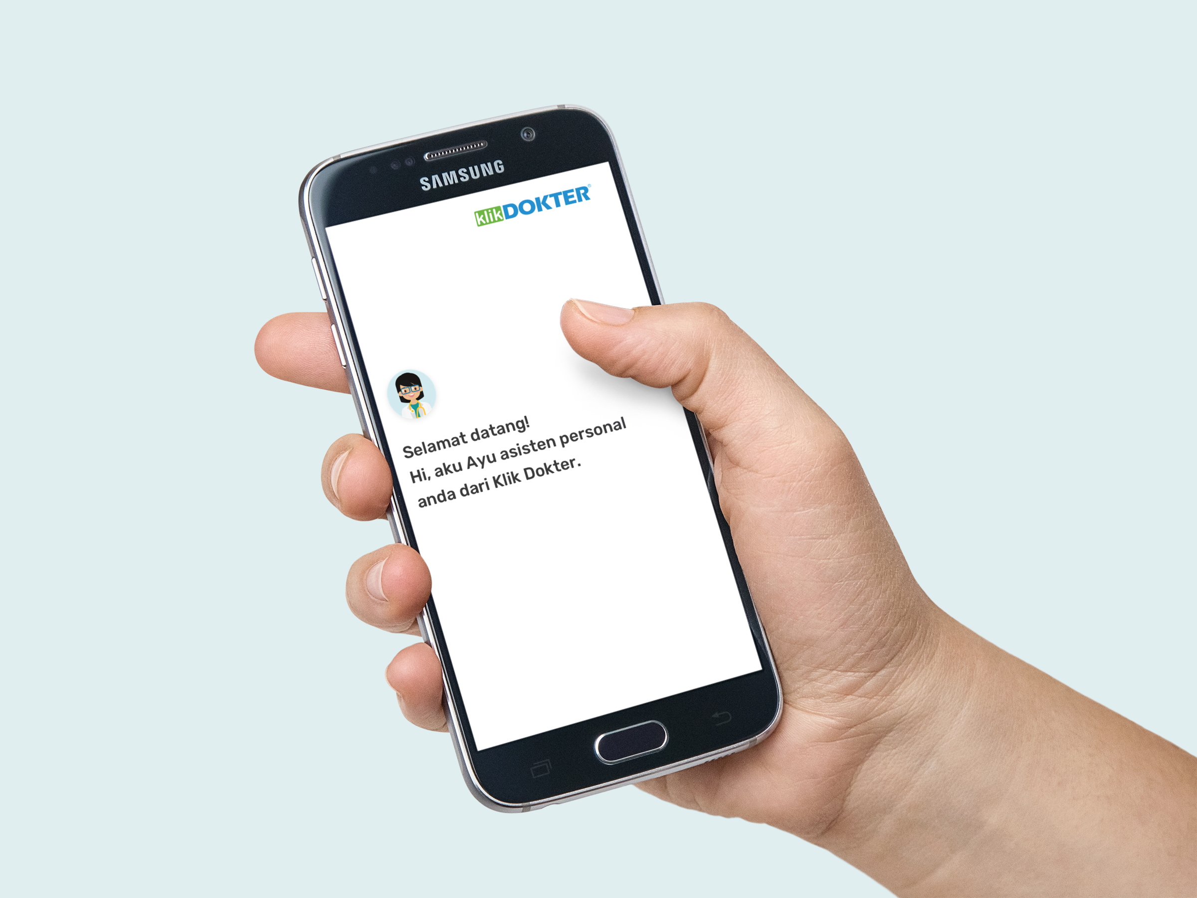
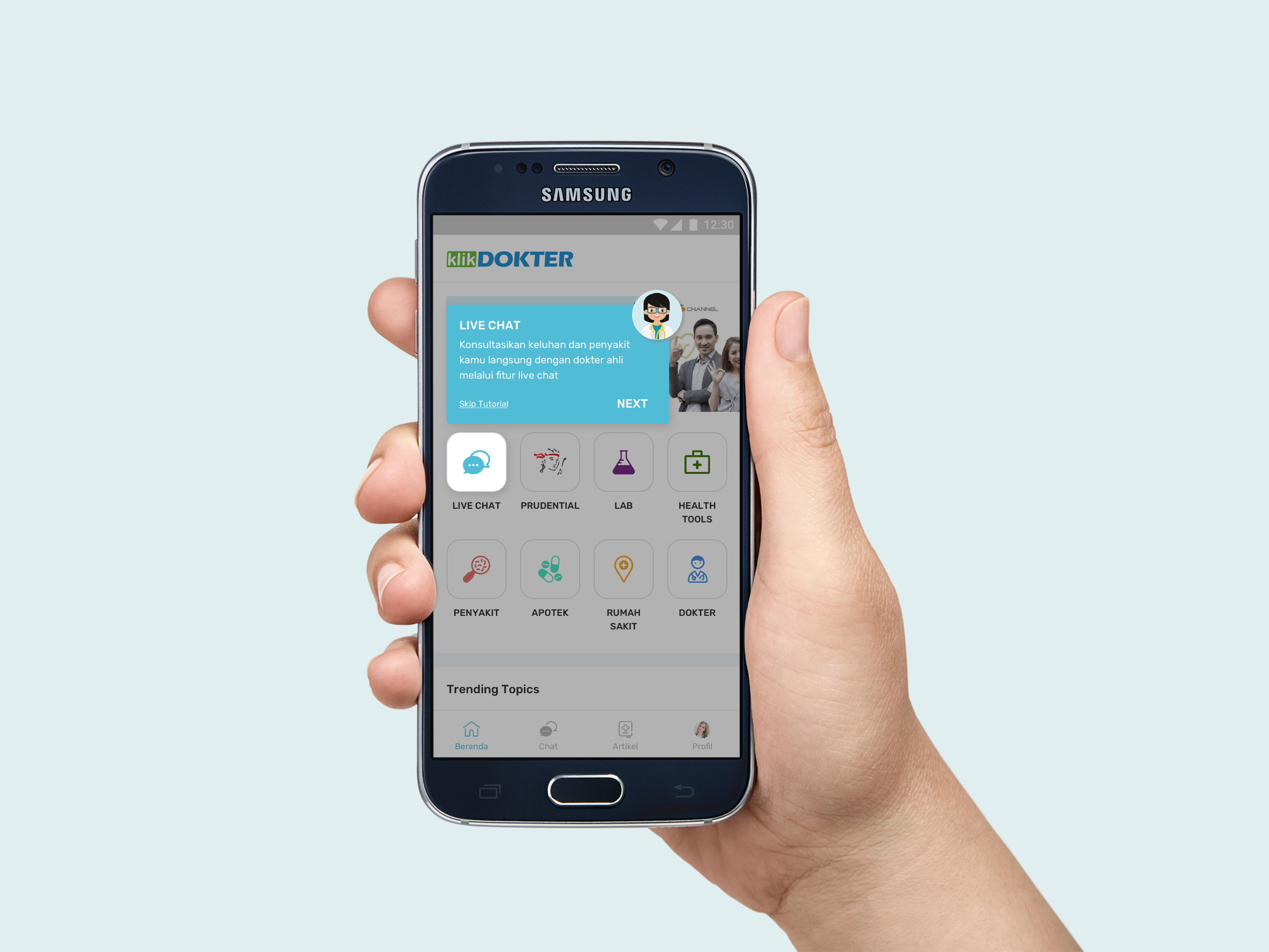
Chatbot on Klikdokter App
May 2018
Researcher: Meidirasari Putri
Designer: Rizka Arika
Background
Klikdokter is implementing Chatbot on their mobile apps. In this project, they are expecting Chatbot is not just saying hi to users, but also to offer the user various service, such as: Medical reminder, Doctor Appointment, Health tools, etc.
Research Objective
This project aims to investigating what user needs while they are experiencing with Chatbot on health application.
#1 Heuristic Evaluation
There are several common methods to finish this project. Initially, UI/UX team would have a #1 Heuristic Evaluation for several times. This aims, of course, to evaluate the exisiting design along with designers, researchers and product managers. The results were implemented to the final prototype, just before usability testing.
![]()
(One of issues should be improved before usability testing)
(One of issues should be improved before usability testing)
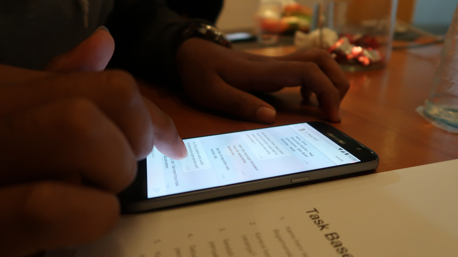
#2 Usability Testing
Yep, you heard it. After Heuristic Evaluation, we were conducting #2 Usability Testing.
Indeed, before the test started, a set of scenario and tasks are prepared. I, personally, find myself more familiar with Canvasflip for doing prototype (but sometimes inVision works for me too). Then I chose Task Based testing and asked my participants to
experience the prototype.
Indeed, before the test started, a set of scenario and tasks are prepared. I, personally, find myself more familiar with Canvasflip for doing prototype (but sometimes inVision works for me too). Then I chose Task Based testing and asked my participants to
experience the prototype.


The Insights
- Apparently, the majority of participants were not familiar with health application. The most commong thing they have been doing is directly go to Google to check on their symptoms.
- Bot existence was very useful to simplify sign in/log in process, observing symptoms, etc. However, there was still trust issue while interacting with Bot on health application. Participants hesitated to questions and answers Bot provided, especially according to medical treatment.
- The control of Ayu (Klikdokter Personalised Chatbot Name) was not clear enough. Participants expected to have Ayu as smart as a real Doctor.
- The chat experience with Doctor was not totally effective. Participants’ behaviour was not familiar with: to end or delete chats. Normally, people would just let every chat stays on the list and read it for later.
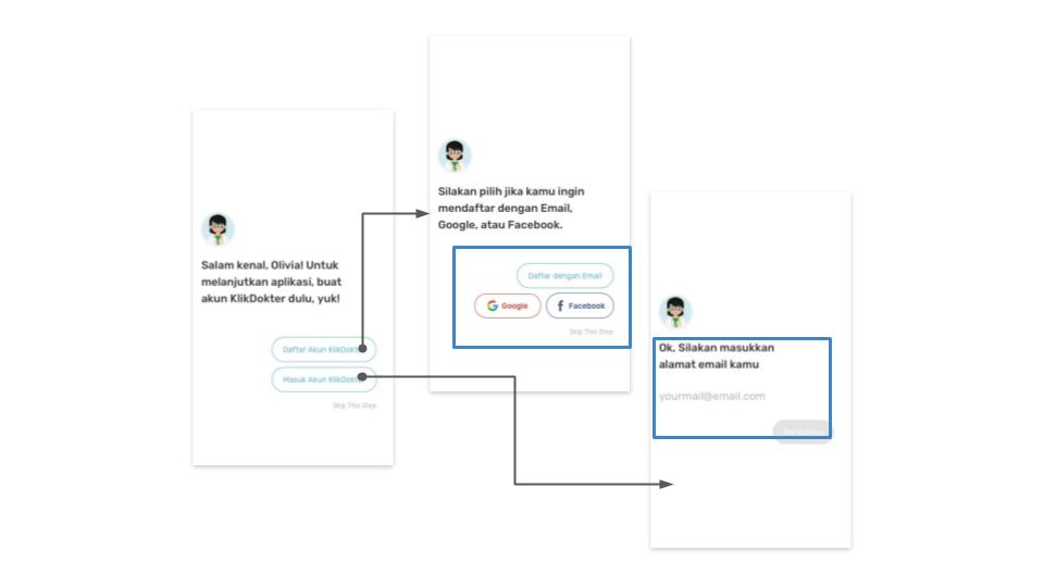
The Recommendations
1. On boarding and Sign up/Log in Process
Adding social media buttons to make the process easier.
![]()
From the previous usability testing we recognized that most of users are keen using social media. We have recommended the design to emphasized social media buttons (filled button).
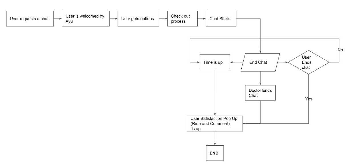
2. Improving the user flow
In this particular case, chat experience is very critical. There are several user basic expectations, which are:
a. User might not end or delete the chat immediately.
b. User expects that system could offer to end the chat automatically.
c. User could read the current or even previous conversations easily
Adding social media buttons to make the process easier.
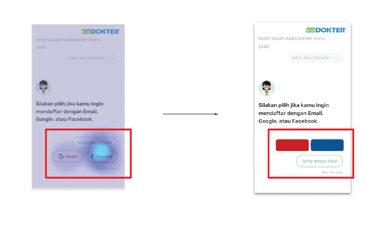
From the previous usability testing we recognized that most of users are keen using social media. We have recommended the design to emphasized social media buttons (filled button).
2. Improving the user flow
In this particular case, chat experience is very critical. There are several user basic expectations, which are:
a. User might not end or delete the chat immediately.
b. User expects that system could offer to end the chat automatically.
c. User could read the current or even previous conversations easily
Conclusions
This project results that the presence of chatbot (Ayu) on Klikdokter app helps user not only in sign in/sign up process, but also as a tool to gather early symtoms before seeing the doctors directly. At this point, a chatbot could save user’s time, especially when filling long forms or even describing their complicated symtoms.
Chatbot is already familiar to tech-savvy users. However, there is still a trust issue using chatbot in medical. People can start using chatbot from simple things, such as medication reminder and giving references of health articles.
Chatbot is already familiar to tech-savvy users. However, there is still a trust issue using chatbot in medical. People can start using chatbot from simple things, such as medication reminder and giving references of health articles.

A Content Management System (CMS) for News Portal Writers.
January 2018
Researcher: Meidirasari Putri
Designer: Pria Kusumawardhana
Apparently, CMS is one of important tool to produce a great content. This is, definitely, very important for media business. Therefore every feature on a CMS should be addressed for every writer’s needs. This project aims to evaluate features needed by writers and to seek the potentials that would please and encourage writers to produce a top-rank contents.
Research Question
How does CMS should look like for writers to produce content comfortably?
Research Objective
Methods
Phase 1: INSPIRATION
Phase 2: IDEATION
Phase 3: IMPLEMENTATION
Research Question
How does CMS should look like for writers to produce content comfortably?
Research Objective
- To examine the current CMS (Liputan6.com)
- To design a new CMS with UI and UX improvements.
Methods
Phase 1: INSPIRATION
- Heuristic Evaluation
- User Feedback
- Technical Briefing
Phase 2: IDEATION
- Wireframing
- Prototyping
Phase 3: IMPLEMENTATION
- Usability Testing
Phase 1: INSPIRATION
Heuristic Evaluation
During heuristic evaluation, team have mapped several issues on the current CMS; which are navigation, elements, user flow and many more.
![]() (One of cases team found during heuristic evaluation. Team believed that the flow was too complicated)
(One of cases team found during heuristic evaluation. Team believed that the flow was too complicated)
 (One of cases team found during heuristic evaluation. Team believed that the flow was too complicated)
User Feedback and Card Sorting
In this stage, team invited 10 writers to tell their story and flow while producing an article. From those interviews, there are found four different problem areas on the CMS: Content, Navigation, Search and Functionality.
Also team asked all of the writers to sort several cards. They need to order the cards based on category to facilitate them while producing a content.
![]()
Also team asked all of the writers to sort several cards. They need to order the cards based on category to facilitate them while producing a content.

Technical Briefing
It’s time to communicate! Research and Design team had a discussion with Product Manager and Engineering team to prioritise things before develop the product.
Phase 2: IDEATION
Wireframing and Prototyping
Visualisation time!
I collaborate with the Designer to implement the previous findings to be visualised.
I collaborate with the Designer to implement the previous findings to be visualised.

Phase 3: IMPLEMENTATION
Usability Testing
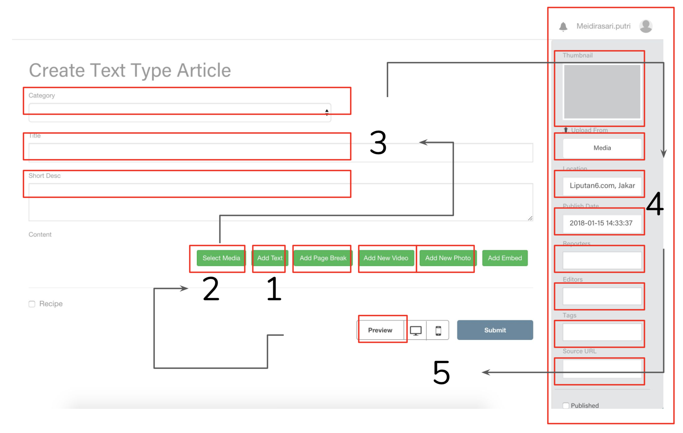
Before going to the development process, team have conducted a usability testing to examine our prototype. We recruited four participants to become testers. A set of scenarios were prepared to guide participant during the test.#1
New Article as a starting point.
New Article as a starting point.
According to the following heatmap, “+” button that was located on right bottom has impressed the participants. It was considered familiar for writers to create a new content.
![]()

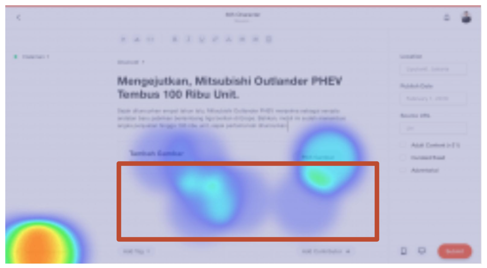
#2
Less intuitive text editor.
Less intuitive text editor.
Shown on the following heatmap, the majority of participants failed to finish this task. There were several factors that might cause this issue:
![]()
- There was no indicator how writer should start writing the first paragraph.
- Participants might be still stuck with their old habit.
#3
Fresh look!
Fresh look!
Apart from minor issues, all of participants were satisfied by the new CMS. It offered clean look, as well as more comfortable flow to create contents.

Old vs New CMS Design